
This all started with a customer coming to us with a simple question around Kubernetes management and maintaining an inventory of who’s running what, where. They manage a platform of hundreds of nodes on GKE, that is being used by 8 different development teams to deploy their applications and services. They had a specific internal customer running a geolocation service that they wanted to go in and troubleshoot on both a physical infrastructure level as well as make to the Kubernetes deployment managing that service.
How can I see all hosts and Kubernetes deployments where the process ‘navguide’ is running?
Finding all the hosts where a process is running is a question that is as old as time, but when you need to associate that physical process with something that is a logical construct like a Kubernetes deployment that question gets much harder. On top of that it becomes even more complicated to merge both physical entities like hosts, with logical entities like Kubernetes deployments in a single graph.
Scanning time-series line charts or other traditional visualizations is nice, but they only really allow you to compare values against one entity, like a host, container, or cloud region. By using a table you can combine multiple entities with as many metrics needed to solve your problem and give you the information you need in an easy to consume format.
The motivation for Sysdig Table Panels
The Explore page in Sysdig Monitor is one of our customer’s favorite areas in the application. It allows users to investigate issues on the fly and decompose their entire infrastructure dynamically from cluster -> service -> container -> processes inside containers.
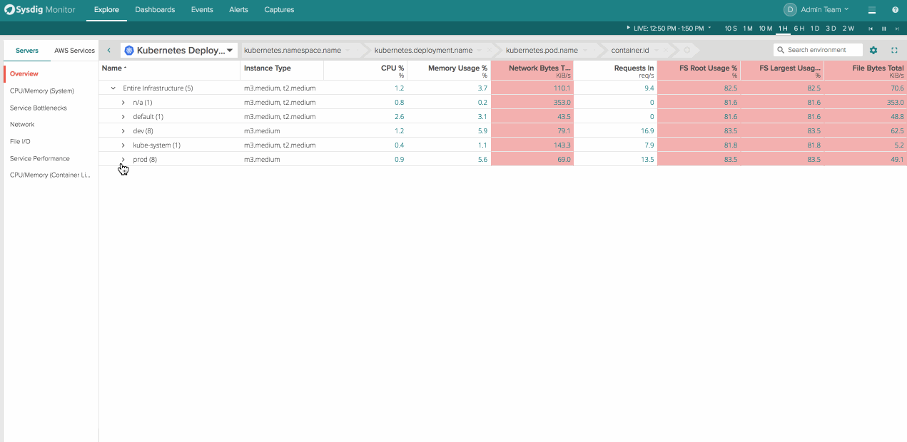
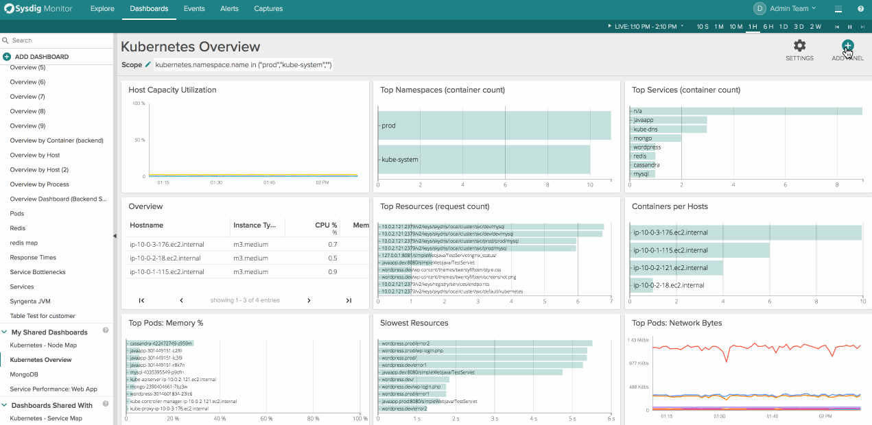
This flexibility to group and organize your infrastructure in ways custom to your environment is crazy powerful for troubleshooting issues. It’s easy to scan, customize, and scope on the fly. What’s missing is the ability to get this functionality in your tradition dashboard view and get visibility into hosts, services, and containers for inventory and usage reporting. That’s why we decided to bring everything our customers loved about Explore into dashboards.
Using Sysdig Table Panels
To create a new table panel click “Add Panel” in the top right corner of a dashboard and then navigate to the table icon on the far right. From here you can choose any arbitrary physical or logical entity and the metrics you’d want to associate with it.
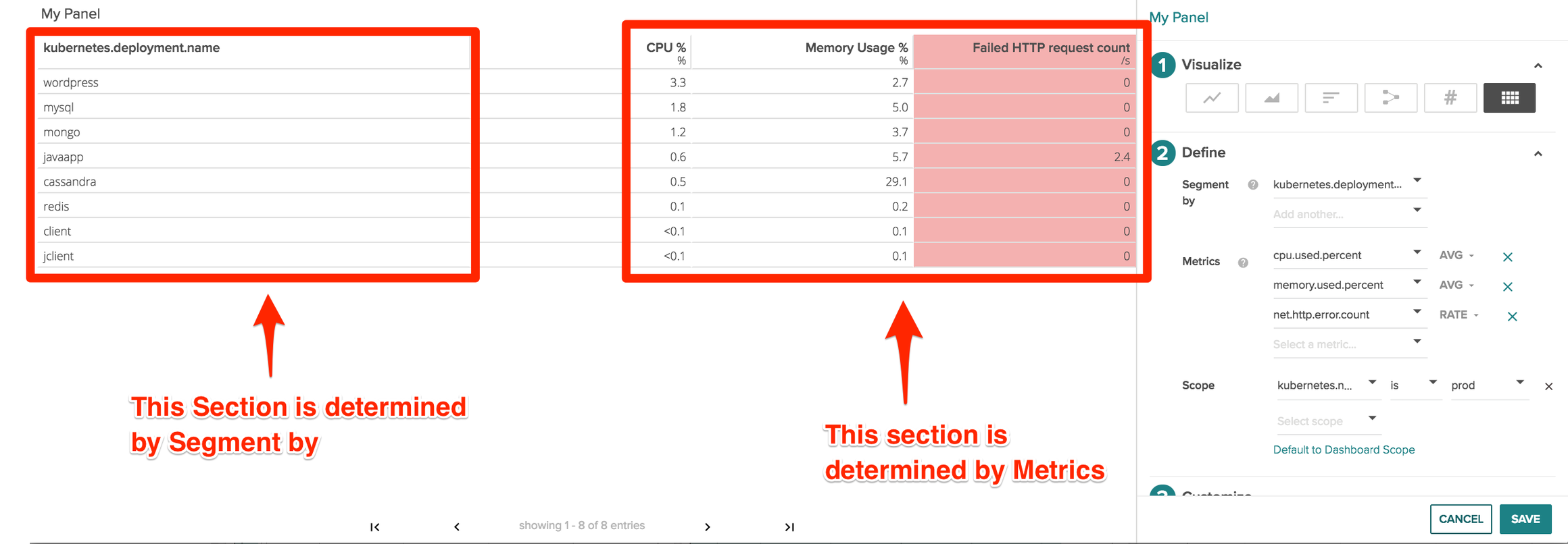
There are 3 main parts of a table panel.
- Segment by: This determines the column on the left hand side of the table and shows the different values for the key that is show in the column header. You can add multiple segmentations which we’ll cover below.
- Metrics – this displays the different metrics and values that we’re collecting like CPU usage, memory usage, or even metrics like failed HTTP request counts
- Scope – What area of your infrastructure you’d like to pull metrics from. Scopings could be Kubernetes.namespace.name, cloudprovider.region, IP.address, and even proc.name or proc.commandline
Kuberenetes Mangement – Tying Processes to Hosts & Kubernetes Deployments
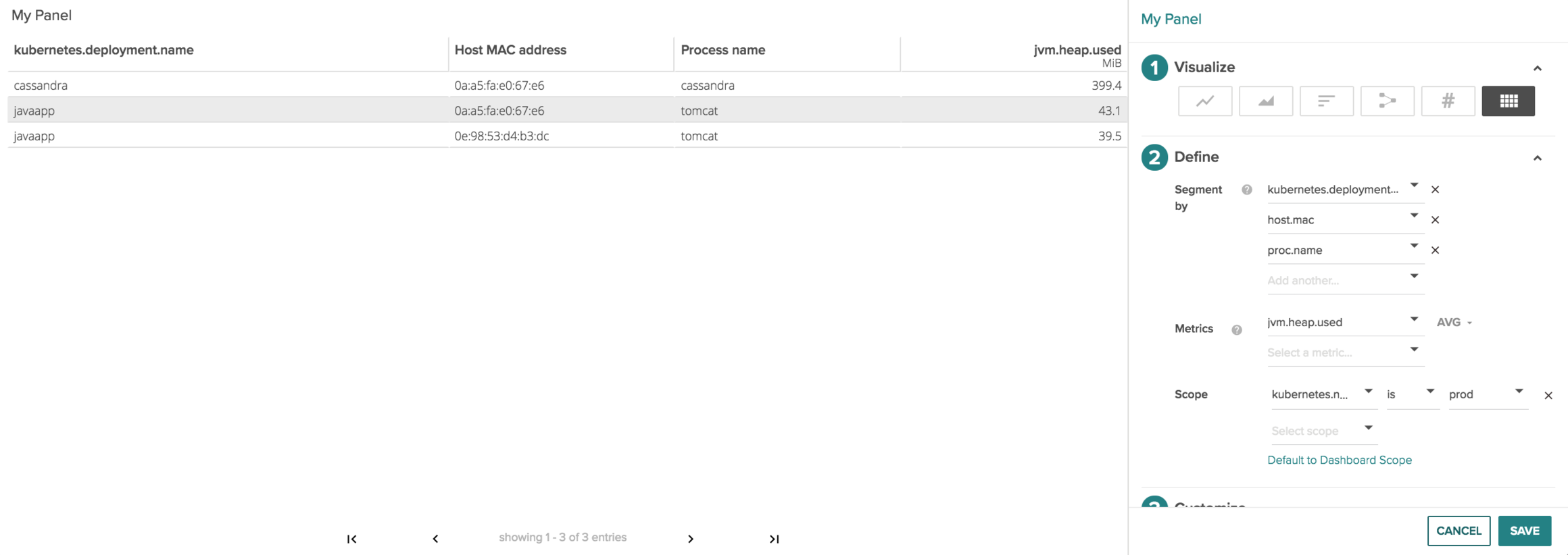
Next let’s look at the image above and break it down left to right to parse the information we are collecting.
A cassandra Kubernetes deployment is running on the host 0a:a5:fa:e0:67:e6 where the cassandra process is 399.4 MiB jvm.heap.used
The lines below show a javapp kuberenetes deployment is running on hosts 0a:a5:fa:e0:67:e6 and 0e:98:53:d4:b3:dc where the tomcat processes are respectively 43.1 MiB and 39.5 MiB jvm.heap.used.
By doing this we can quickly tell everywhere java is running in my kubernetes prod namespace, and how much heap is being used per deployment on a host by host basis.
Kubernetes Management – Deployment status codes & errors
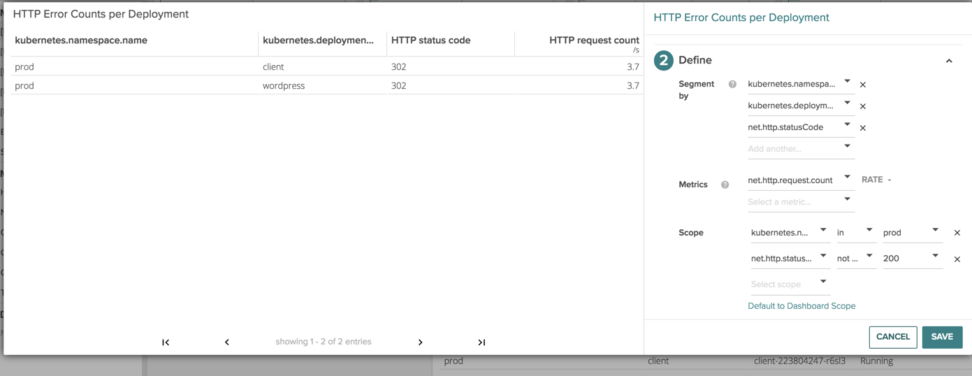
Lets now take more of a developer centric view and look at the different error counts and status codes that are happening in our environment.
Starting on the left we can see the deployment, the container that’s running within the deployment, the specific status code and the amount of http requests with that specific code.
The powerful thing to notice here is we can see here is which containers are part of my Kubernetes infrastructure and which are not. Troubleshooting a supposed Kubernetes network issue becomes a lot easier when you know the issue is actually has nothing to do with Kubernetes in the first place :)
** Conclusion**
Graphs are good for some things, and tables are good for others, whatever it comes down to we want to give you the flexibility to view the data in the right way for the right problem.
Let us know how you use Sysdig table panels to figure out what’s running where, and how it’s performing!