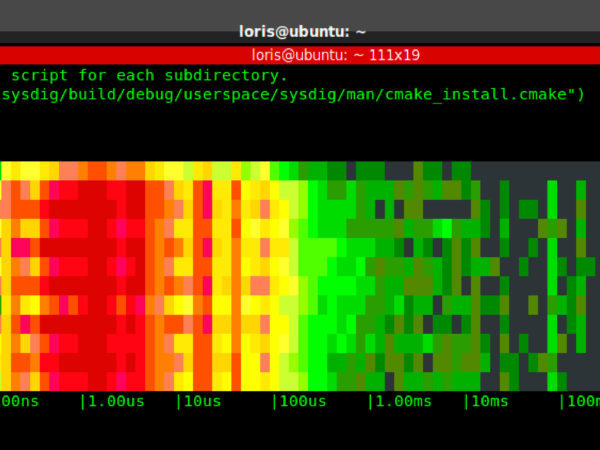
Having worked for several years in the wireless networking space, I always found spectrum analyzers like
this one extremely useful. I always found such a representation of the wireless spectrum not only visually cool, but also useful to understand trends, spot bottlenecks and identify outliers. A
bunch of attempts have been done to apply this kind of visualization to OS activity, but I started wondering if the concept could be exported in a way that is easier to consume, lightweight and real time.
To answer the question, I embarked on a couple of weekends of sysdig
chisel fun, and this blog post showcases the result: a chisel called spectrogram which offers a
real time representation of operating system latency
from inside a terminal, by using the ANSI coloring functionality. The chisel is able to display latency for a bunch of things, including disk I/O, network I/O, IPC, and so on.
I’m also going to try to prove that this is more than mesmerizing eye candy by presenting a practical use case in which I compare the performance of different types of storage that you can mount on an Amazon EC2 instance: local SSD storage, magnetic EBS network volumes and SSD EBS network volumes.
What Is This Spectrogram Thing?
In this case, showing might be easier than telling. Check out the animated gif above, and the following picture:
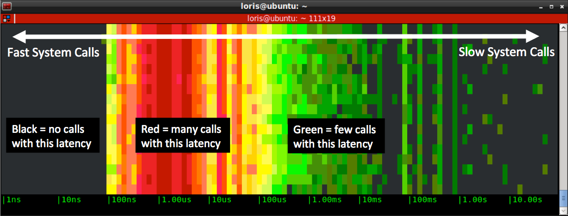
This is what the spectrogram chisel actual does:
- it captures every system call (e.g. open, close, read, write, socket…) and it measures the call’s latency, i.e. the time it takes the call to return.
- it subdivides latencies into buckets ranging from 1 nanosecond to 10 seconds, and counts how many calls fit in each of the buckets.
- twice a second (this interval can be configured) it draws the buckets in a new line, using color to indicate how many calls are in each bucket
- black means no calls during the last sample
- shades of green mean 0 to 100 calls
- shades of yellow mean hundreds of calls
- shades of red mean thousands of calls or more
As a consequence, the left side of the diagram tends to show stuff that is fast, while the right side shows stuff that is slow.
Note that this will work from inside any terminal, including ssh sessions, without needing any graphical capability.
Tweaking the Spectrogram
Now that we covered the basics, here are a couple of useful tricks. First of all, making the chart move faster or slower is just a matter of specifying a refresh time in milliseconds on the command line. For example, this version will update 5 times a second:
# sysdig -c spectrogram 200
More importantly, you can use sysdig
filters to restrict what the chart shows, which makes it much more useful. For example, you can follow a specific process:
# sysdig -c spectrogram proc.name=httpd
You can also limit the observation to a particular kind of activity, for example file system I/O:
# sysdig -c spectrogram proc.name=httpd and fd.type=file
You can even remove parts of the chart that you’re not interested in. For example, this will only show you calls whose latency is higher than 1ms:
# sysdig -c spectrogram “proc.name=httpd and fd.type=file and evt.latency > 1000000”
These are just examples of course. The full sysdig filtering functionality is supported, so you can slice and dice your system latency in a very flexible way.
The last important thing to keep in mind is that this works either live or on sysdig trace files that you capture with the -w command line switch:
# sysdig -w tracefile.scap
At that point you can instantly obtain the full file spectrum with:
# sysdig -r tracefile.scap -c spectrogram
This is especially useful when investigating issues whose source is unclear, as it lets you iteratively apply filters. For example, if you are curious what causes a high latency spot, you can look at the events that generated it. For example, this shows all the events that take longer than one second to return.
# sysdig -r tracefile.scap “evt.latency > 1000000000”
A Comparison of EC2 Storage Options
Let’s show the usefulness of this visualization with a practical example. I’m going to spin up an m3.medium instance on AWS and attach three different file systems to it: a local SSD instance storage volume, a magnetic EBS network volume and a SSD EBS network volume. They are all formatted with ext4, and they are attached to the following mount points:
local SSD instance storage >> /mnt
magnetic EBS network volume >> /ebs1
SSD EBS network volume >> /ebs2
No customization or tuning has been made, so this is the vanilla setup that you get from Amazon.
I wrote a little C program that writes buffers of given size into these file systems, at specific rates. I’m going to ssh into the box and capture the spectrum of different runs of the program, by using the following command line:
# sysdig -c spectrogram "proc.name=test and evt.is_io_write=true and fd.name contains /mnt"
The filter means “show I/O writes generated by processes with name
test on files that contain
/mnt in their full name”.
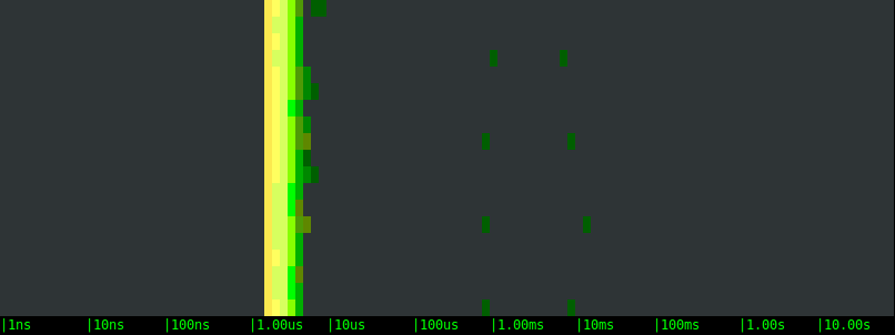
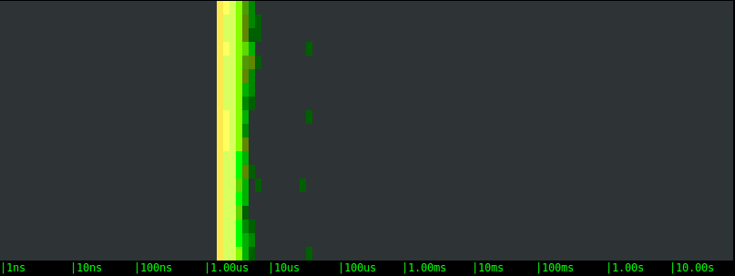
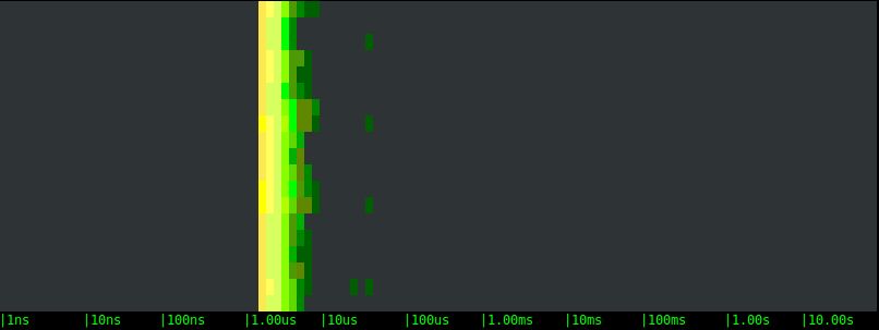
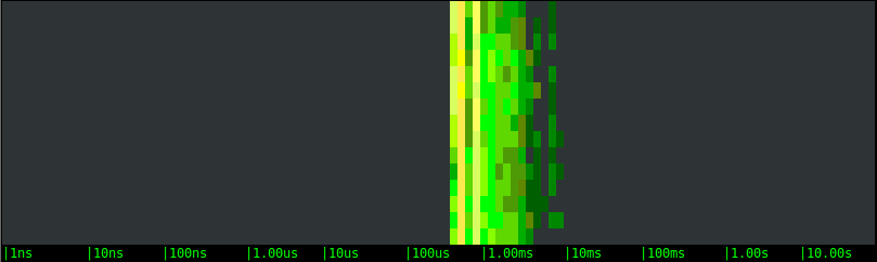
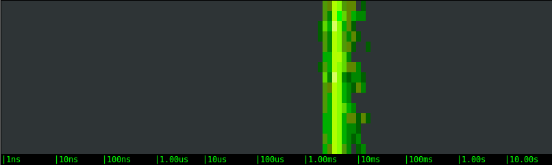
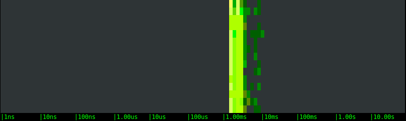
Test 1: Moderate Activity
Let’s start by generating moderate disk activity: 1000 writes per second of a buffer that is 1KB in size. Here are the results.
Local SSD drive:
Magnetic EBS network volume:
SSD EBS network volume:
Let’s take a look the charts:
- All of the options are on average very fast, with the bulk of the writes returning in a handful of microseconds.
- On average, the three storage options are clearly equivalent. This likely indicates that, at these rates, the latency is determined not by the actual storage, but by the OS latencies.
- In all of the tests, slow writes happen at a regular interval of few seconds. This is likely the result of cache flushes, or the execution of some synchronous FS operation. We can see that the periodicity is the same with the different volumes, but the latency magnitude is very different. The EBS volumes block the application once and for 40-50 microseconds. The local SSD drive, on the other hand, blocks the application a couple of times, once for around 1 millisecond and once for 10 milliseconds or more.
This is extremely interesting. If you have a latency sensitive application, like a typical web server, the “bad” high latency I/O operations are what you really care about, because they introduce a hard to predict delay to some of your requests. The interesting conclusion here is that, with a moderate but non negligible workload like the one we’re simulating, a local SSD drive not only doesn’t bring any measurable advantage, but it could even add latency to some of the requests. And not just a little latency, but tens of milliseconds, an amount that is definitely going to be measurable in terms of response time.
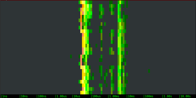
Test 2: Sustained Activity
Now let’s try to stress test our volumes, by writing 100KB buffers as fast as possible.
Local SSD drive:
Magnetic EBS network volume:
SSD EBS network volume:
The results are very different this time:
- The latency distribution has clearly become bimodal. Other than some noise in the middle, for example, the writes to the local SSD drive either take around 50us or around 5ms. This is a clear indication of file system caching.
- Overall, the local SSD drive is sustaining the load very well, with consistent performance and very few latency outliers.
- The remote volumes show a bimodal behavior as well, with very similar ranges, but they introduce an additional pattern. Every few seconds one of the writes takes forever. You can notice the long periods of inactivity, and after that a green dot at the right of the chart: that’s our slow call. What is likely happening is: the local cache saturates and when that happens the application has to wait until the local data is pushed to the remote volume. Boy, you sure don’t want one of your critical code paths to hit one of these slow calls.
- With this specific bandwidth-intensive workload, the remote SSD option doesn’t show any advantage over the magnetic one. They actually essentially look identical.
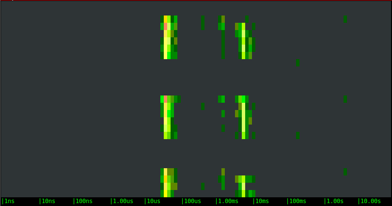
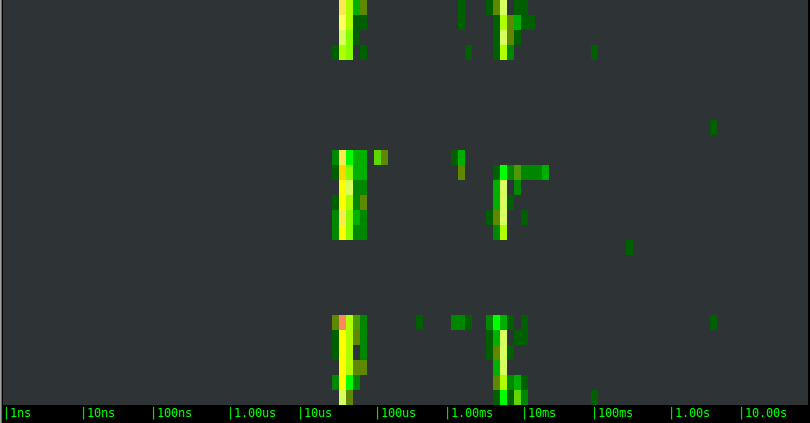
Test 3: Sustained Activity with Caching Disabled
To complete the picture, I’ll run one more set of tests, with the same stress test load, but this time I’m going to disable OS caching by using the O_SYNC and O_DIRECT flags when opening the file for writing.
Local SSD drive:
Magnetic EBS network volume:
SSD EBS network volume:
As expected, the bimodal behavior disappears, results are much more consistent, and the difference among the magnetic and SSD EBS options becomes clear. The local SSD option, in particular, is around a magnitude order faster, which is consistent with the throughput that I’m observing during the tests.
Conclusions
The moral of this story is: pick more expensive storage options only if you’re sure you need them, and take into account latency outliers that can sometimes slow your own application down for a very long time.
And, in order to take the best decisions, measure things: despite the results in this post being extremely interesting, these are synthetic tests that don’t necessarily reflect or predict behavior in production environments. Fortunately, there’s a very easy way to see what your own environment looks like:
install sysdig and give the spectrogram a try! Installation takes only 10 seconds, and you will be surprised how easy it is to get useful results out of it.
By the way, if you care about the performance of your distributed environment, I encourage you to sign up for our beta SaaS offering,
Sysdig Monitor, and follow us on
twitter.
If you live in the Bay Area, I hope you’ll come to our
meetup in a couple weeks and talk to me about your experience with sysdig. I’ll be sharing more interesting details on this experiment, as well as offering a sneak peek at sysdig’s new container support.
Happy digging!

 Having worked for several years in the wireless networking space, I always found spectrum analyzers like this one extremely useful. I always found such a representation of the wireless spectrum not only visually cool, but also useful to understand trends, spot bottlenecks and identify outliers. A bunch of attempts have been done to apply this kind of visualization to OS activity, but I started wondering if the concept could be exported in a way that is easier to consume, lightweight and real time.
To answer the question, I embarked on a couple of weekends of sysdig chisel fun, and this blog post showcases the result: a chisel called spectrogram which offers a real time representation of operating system latency from inside a terminal, by using the ANSI coloring functionality. The chisel is able to display latency for a bunch of things, including disk I/O, network I/O, IPC, and so on.
I’m also going to try to prove that this is more than mesmerizing eye candy by presenting a practical use case in which I compare the performance of different types of storage that you can mount on an Amazon EC2 instance: local SSD storage, magnetic EBS network volumes and SSD EBS network volumes.
Having worked for several years in the wireless networking space, I always found spectrum analyzers like this one extremely useful. I always found such a representation of the wireless spectrum not only visually cool, but also useful to understand trends, spot bottlenecks and identify outliers. A bunch of attempts have been done to apply this kind of visualization to OS activity, but I started wondering if the concept could be exported in a way that is easier to consume, lightweight and real time.
To answer the question, I embarked on a couple of weekends of sysdig chisel fun, and this blog post showcases the result: a chisel called spectrogram which offers a real time representation of operating system latency from inside a terminal, by using the ANSI coloring functionality. The chisel is able to display latency for a bunch of things, including disk I/O, network I/O, IPC, and so on.
I’m also going to try to prove that this is more than mesmerizing eye candy by presenting a practical use case in which I compare the performance of different types of storage that you can mount on an Amazon EC2 instance: local SSD storage, magnetic EBS network volumes and SSD EBS network volumes.