It’s the first day of summer and the perfect opportunity for our summer Sysdig Monitor release round up. For those of you following our progress, we use these blogs to showcase the work we’ve done to add increased functionality, scale, and usability with Sysdig Monitor. What follows are quick descriptions of all the good stuff we’ve made available over the past few months. This includes a lot of enhancements to look-and-feel, dashboards, metrics, Kubernetes and Prometheus support and more. Got questions? Need help? Let us know through the app, via Slack, or drop us a line at @sysdig.
Kubernetes-related features
Kubernetes Node Ready alert
A new out-of-the-box alert is available to provide notifications when a Kubernetes node is not ready. By default the alert is set to warning, but severity is user configurable. This feature will help you make sure you have the resources you need up and ready for your Kubernetes-based services.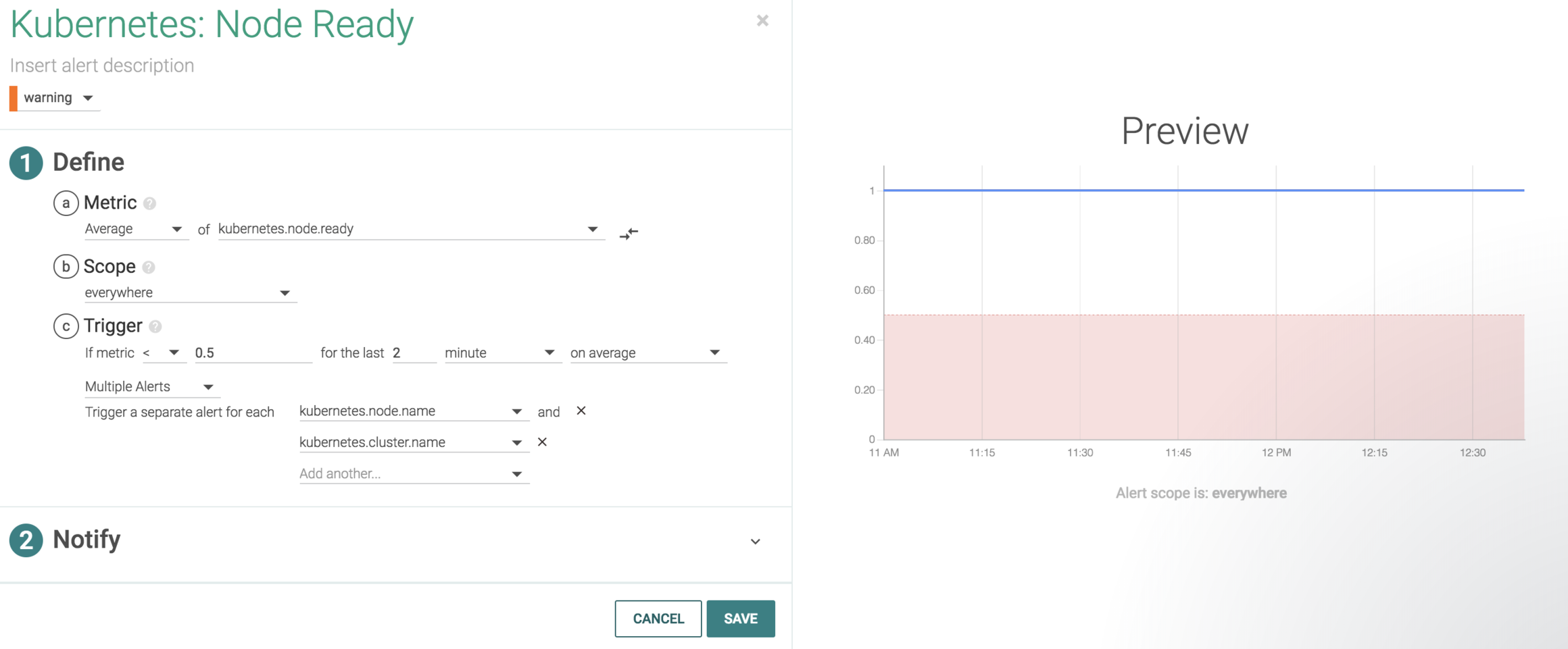
Revised alerting with Kubernetes metrics
Alert configuration settings for Kubernetes metrics now limit scope and segmentation based on the metric that is selected to allow for more accurate alerting. Check out our support page for more details.Prometheus-related features
Support for Prometheus histogram metrics
Sysdig Monitor can now ingest a Prometheus histogram metric type and visualize them in a chart to show the distribution of specific metrics. This gives Prometheus users even more visibility options within Sysdig Monitor to help provide a greater level of insight.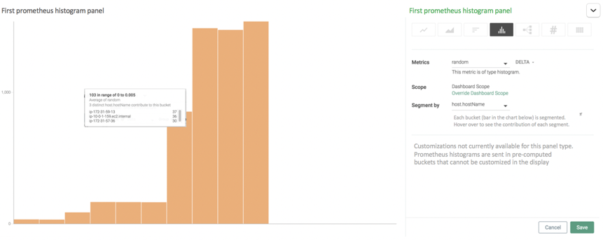
Default Istio dashboards
Sysdig provides out of the box dashboards for monitoring Istio using Prometheus exporters. Istio, an open platform to connect, manage, and secure microservices, is growing in popularity – especially with Kubernetes users. Now you get instant visibility to the most important metrics for this service mesh capability.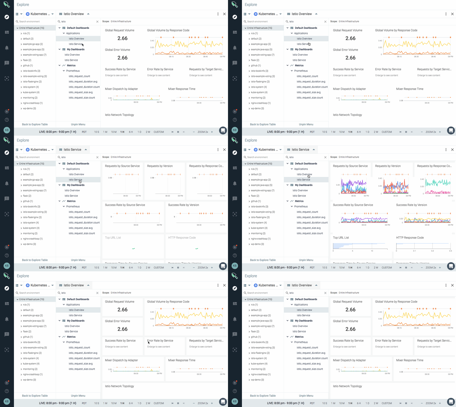
Link to Grafana plugin
Did you know you can add Sysdig as a Grafana data source? To help you get started visualizing Sysdig-collected metrics in Grafana, we’ve added a Grafana Plugin link to the help menu that takes you to the setup instructions.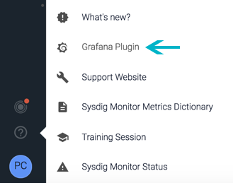 Check out all the cool stuff @sysdig has released with Sysdig Monitor – #kubernetes #prometheus and more!
Click to tweet
Usability-related features
New UI design
Our new user interface provides a more modern framework for interacting with the product. Navigation is re-oriented from a top-of-screen menu to an icon-driven left side panel, providing more space for viewing your metrics and dashboards. Click here for a quick video introduction!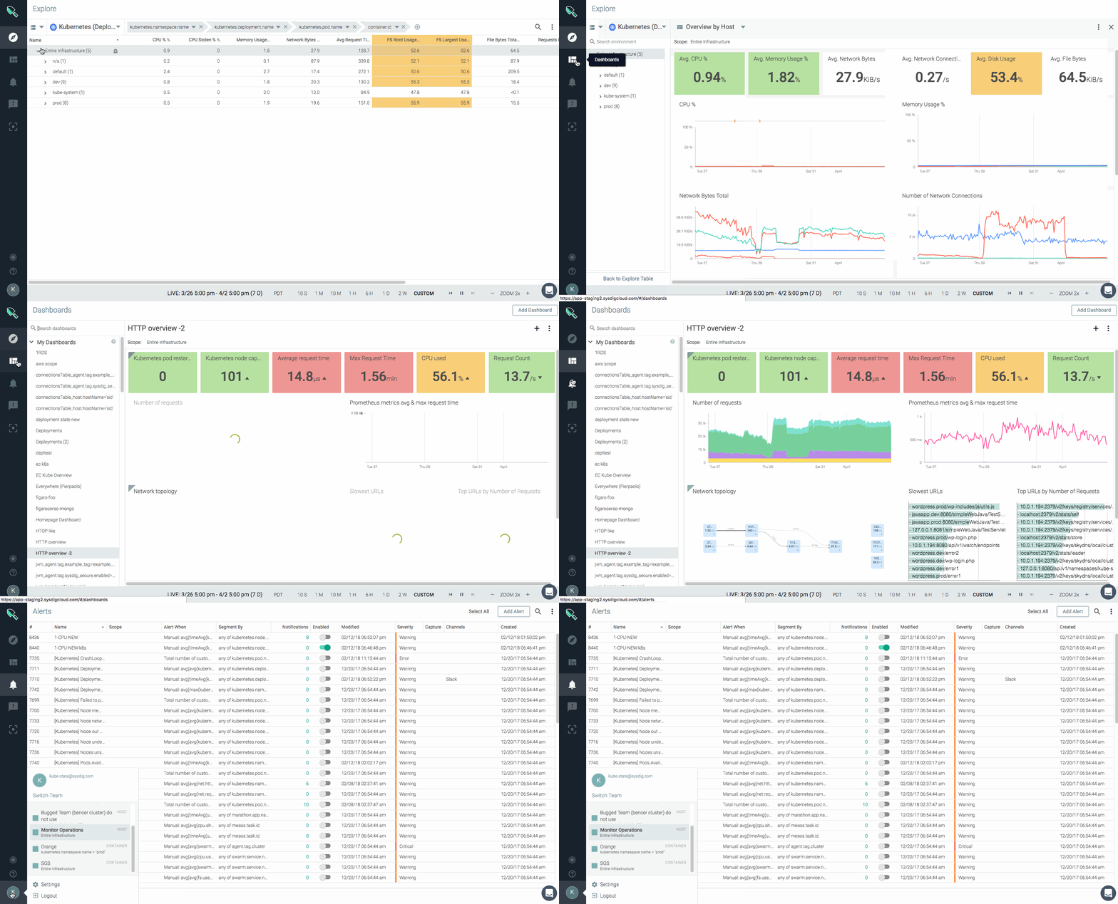
Spotlight
Want a simple way to quickly see what matters most in your environment? Spotlight helps you quickly discover, detect, and optimize your infrastructure and services. A Spotlight health check shows you new integrations, infrastructure, app, and agent status, and more at-a-glance.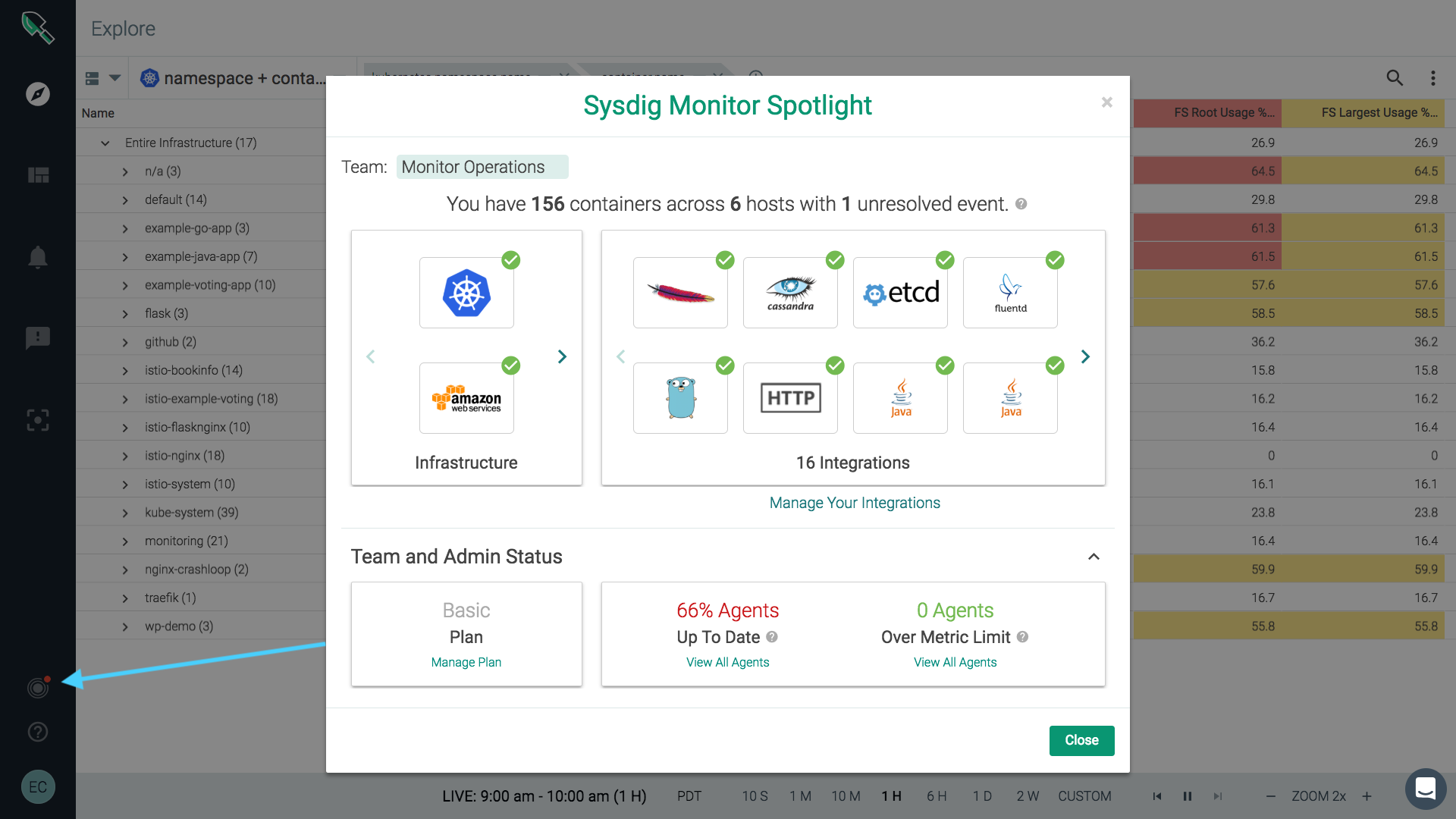
New Explore design {#newexploredesign} We’ve redesigned Sysdig Monitor’s Explore page to give you extra screen space to view your killer dashboards and metrics. The new vertical layout helps you see more and get to what you need faster.
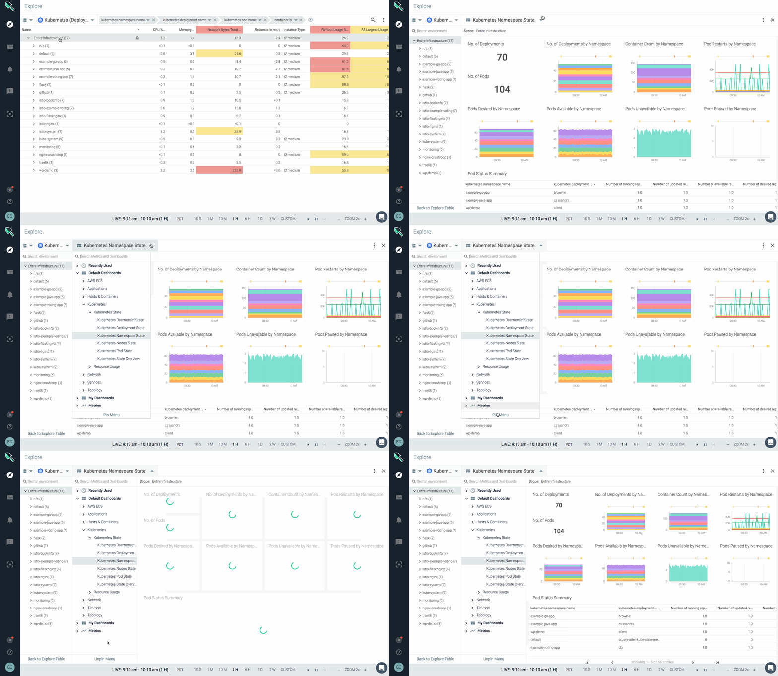
Icon labels
New icon labels appear on hover to clarify underlying function for users. This is a part of our ongoing efforts to increase simplicity and usability across the Sysdig platform.Redesigned login screen
We’ve put a new, more modern face on the Sysdig Monitor login screen.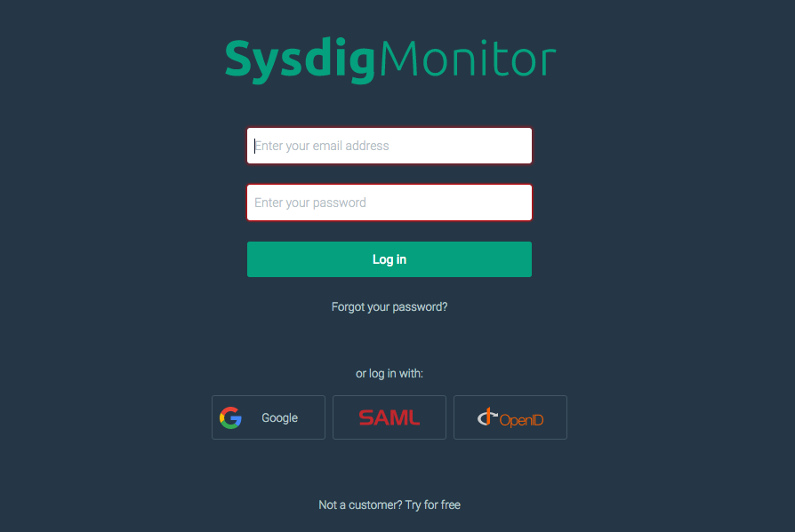
Text panels
You can now add text panels to your dashboards to provide additional information. Text panels can be used as title headers or to provide additional context that you would like to communicate. Features limited markdown support.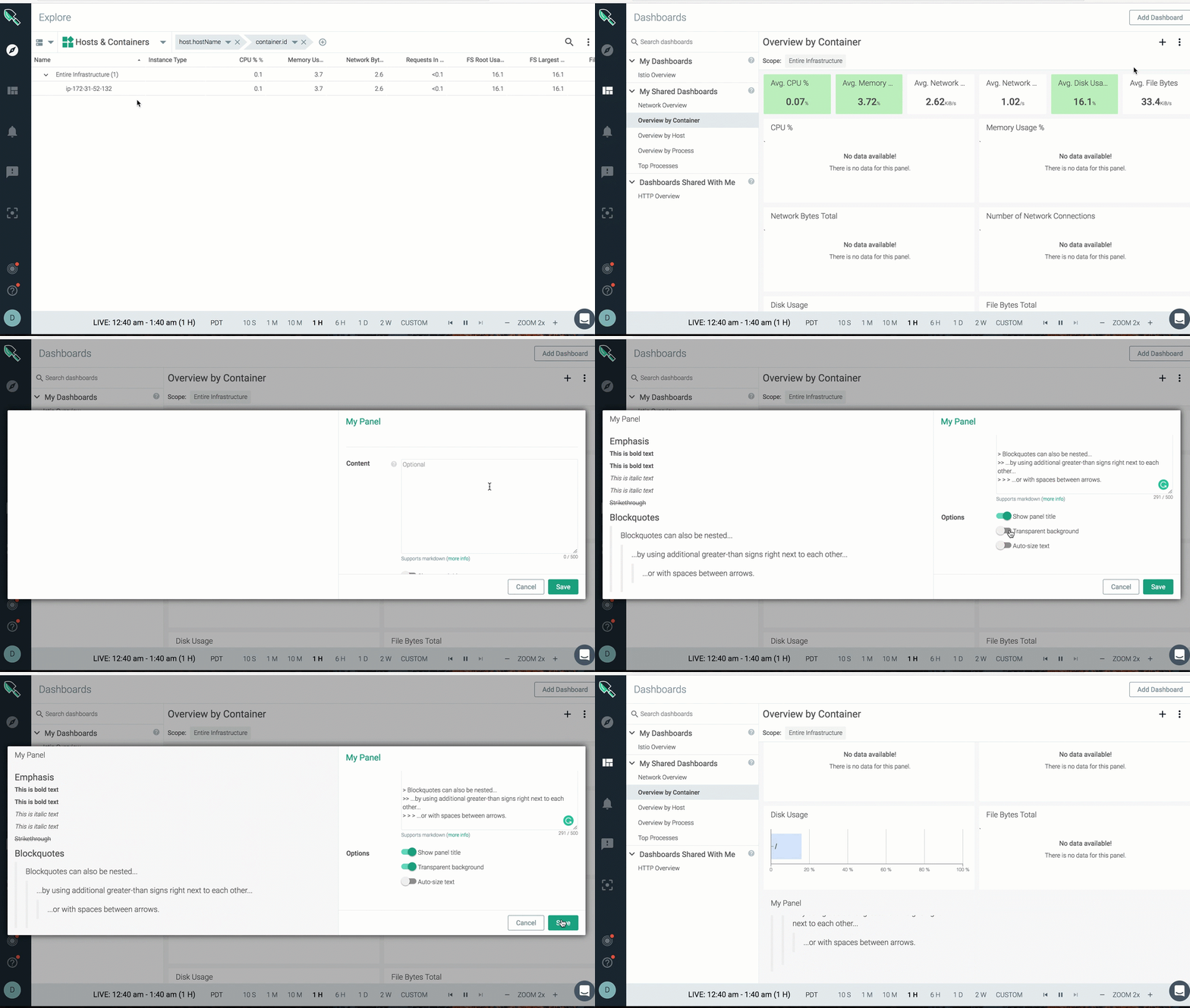
Default entry point
Admins can now set a default entry point for a team to simplify the onboarding process. This determines the first page users see when they start the application (e.g., a specific dashboard, settings, etc.).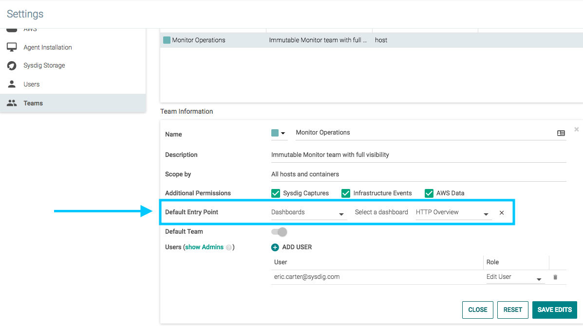
Copy and share groupings
Now you can copy and share unique groupings with all of your teams. This helps save times when working across groups and helping team members see critical metrics and more.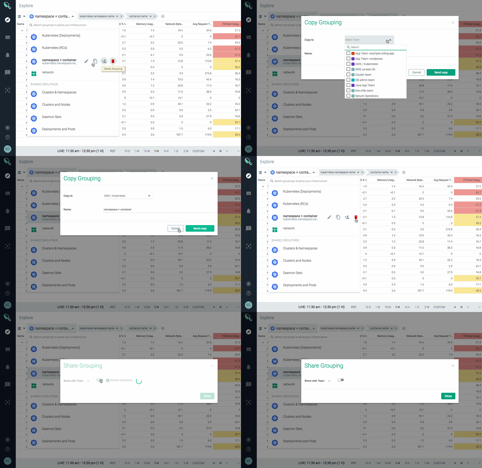
Test notification channels
New test function lets you pre-test your notification channels like, email, Slack, PagerDuty, etc. This capability helps give you the assurance that all messages generated by Sysdig Monitor will be received.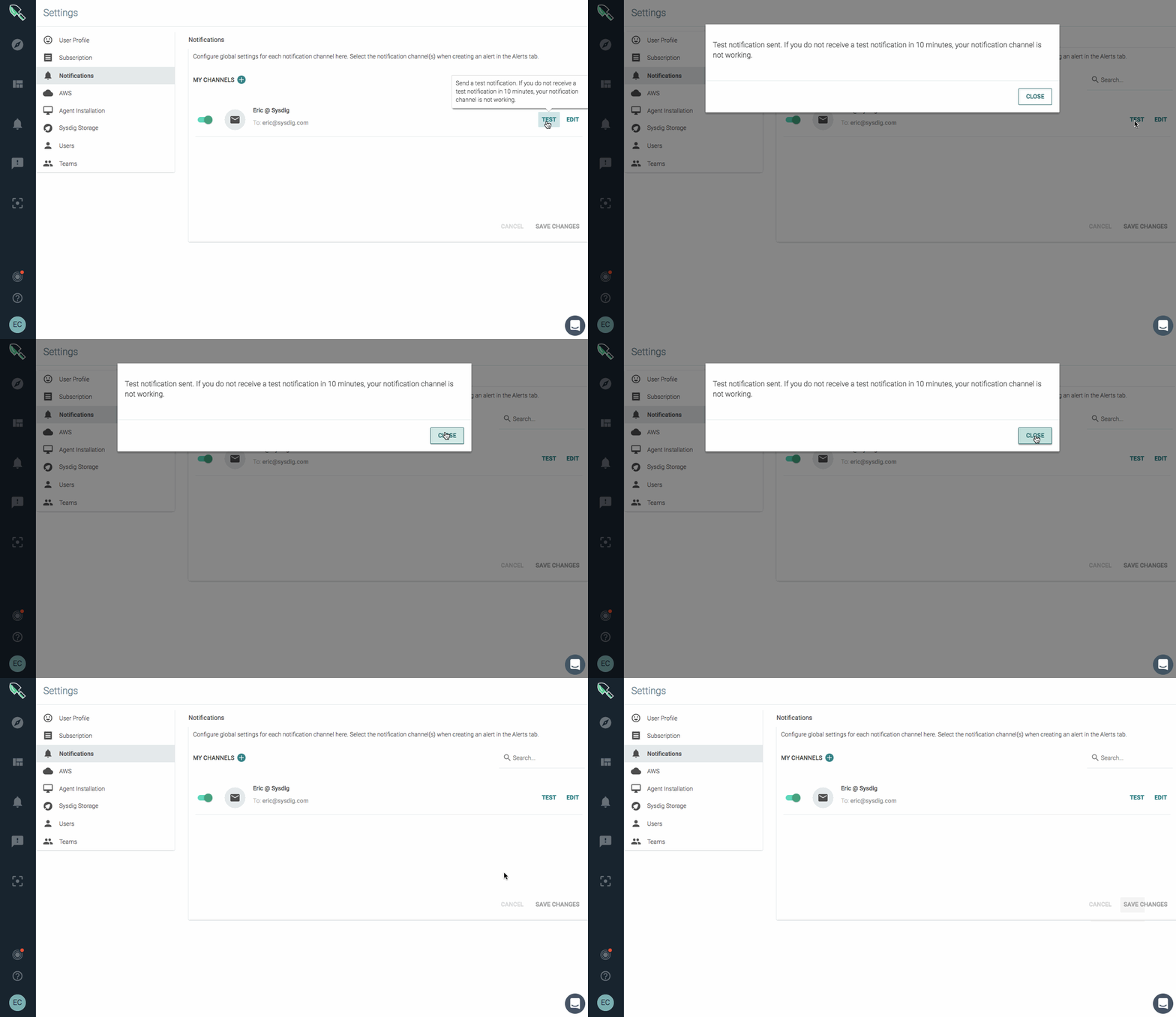
Resizable columns
The UI now allows columns to be resized for all tables in the application including alerts, events, teams, and users.Suggest mode
Suggest mode auto-selects only the relevant dashboards and metrics, hiding any inapplicable views. This is now the normal mode of operation. The turn on/off option is no longer available.Additional UI updates
We’ve simplified the dashboard panel copy function and added a duplicate panel option in menu. We’ve also redesigned the dropdowns in the top right header including making it easier to quickly see and select your teams.Metric-related features
Golden Signals dashboards
New Service Golden Signal dashboards provide out-of-the-box metrics that developers need when launching and monitoring a service or app. Includes slowest transactions, latency, request volume, error rates, and most requested URLs.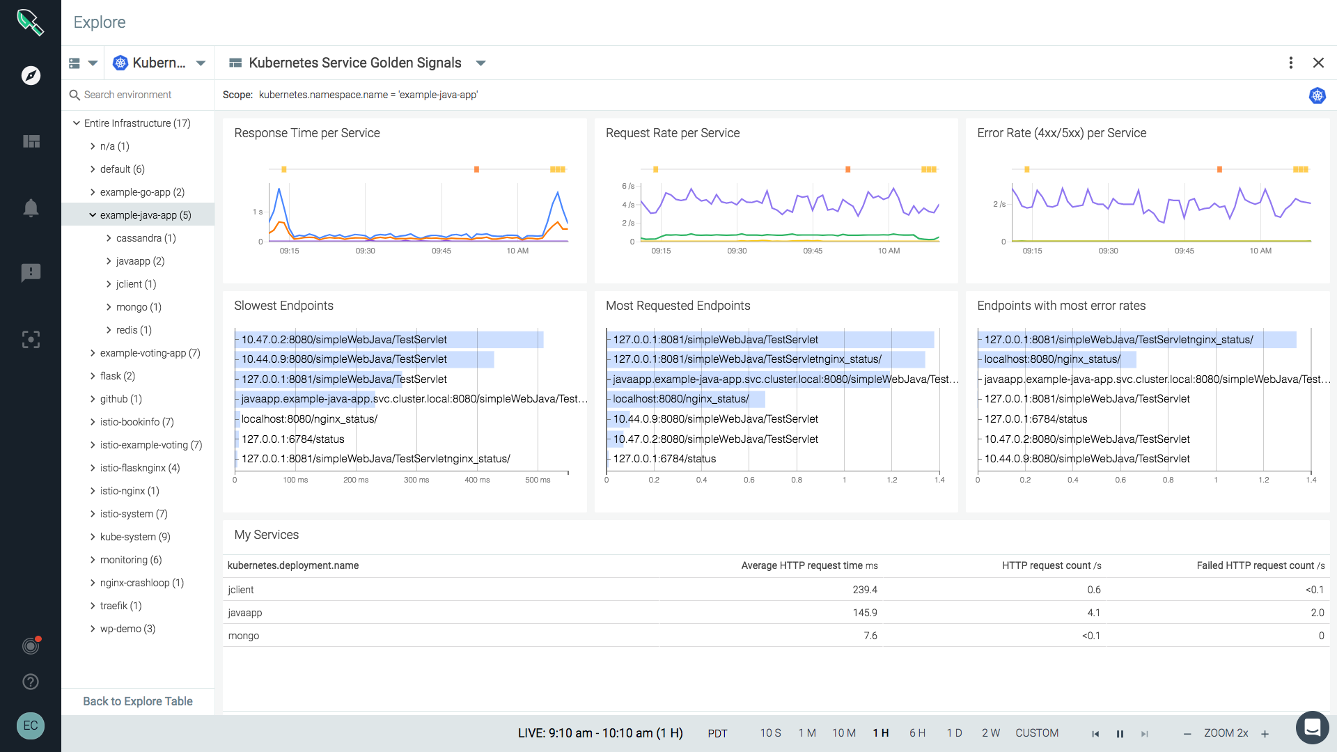
Multiple segments for a single metric
You can now add up to five different segments for a given metric in time-series and stacked area panels.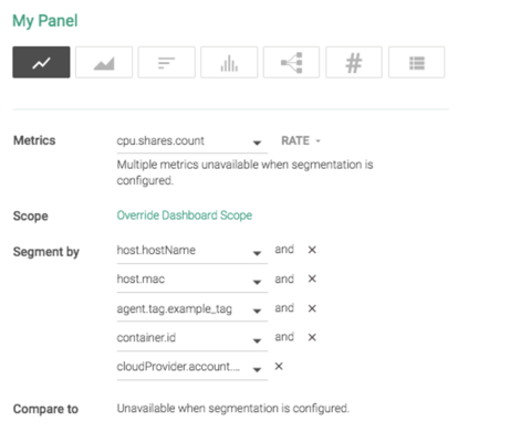
Alert on rate of change
Introducing a new ‘rate of change’ math function for metrics. Now you can alert by the rate at which a metric changes vs. a static threshold. For example, a default alert: Rate of change of disk usage alerts you if your disk usage increases more than x% in a day.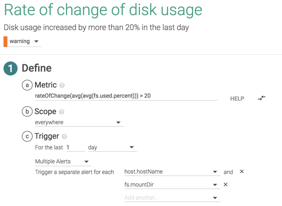
‘Compare to’ for number panels
Metric number panels now feature a configurable ‘Compare to’ function to display the change in measurement since a previous time frame. Provides insight into the increase or decrease of metrics over time.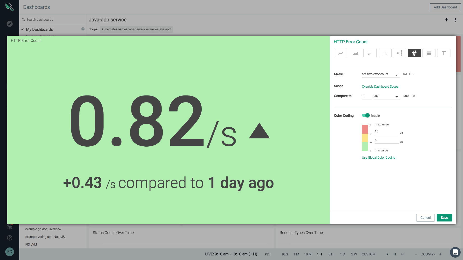
‘Compare to’ for timeseries
In your timeseries line charts you can now compare time-shifting metrics to easily spot trends and anomalies. With compare-to for timeseries you can configure and observe how one or more metrics have changed since a previous time (e.g., 1 hour ago or 2 days ago).
Export table data as JSON/CSV
You can now download table data in JSON or CSV format for offline viewing and analysis. This is a great way to share and work with data offline.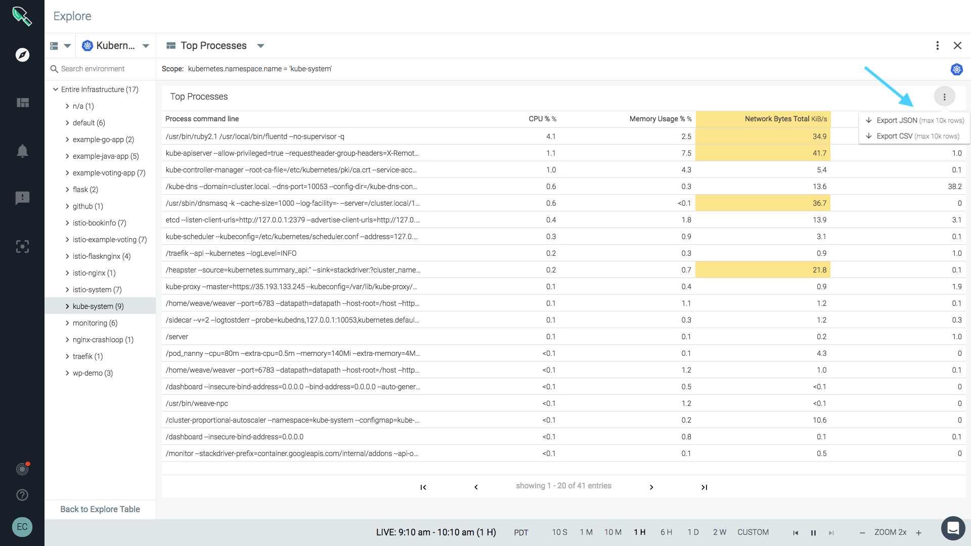
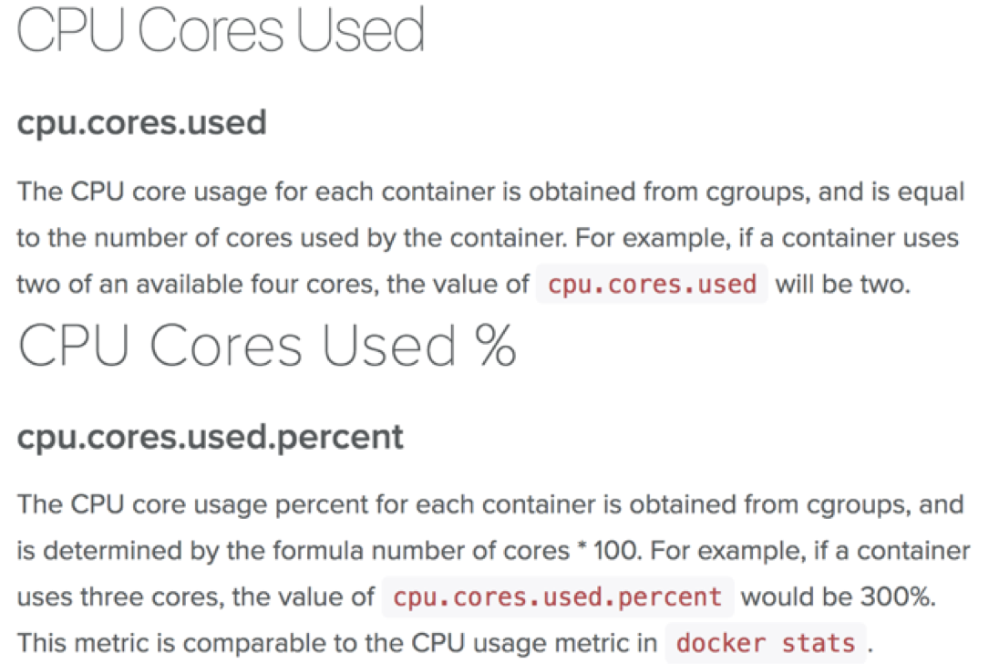
New metrics for cpu core usage
We’ve added cpu.cores.used and cpu.cores.used.percent that align with the way Kubernetes exposes cpu usage. Now you can compare values using kube-state-metrics such as kubernetes.node.capacity.cpuCores, kubernetes.pod.resourceLimits.cpuCores in order to determine if resources are oversubscribed. These metrics are also key for capacity planning and chargeback calculations.