Here at Sysdig, we are constantly trying to improve our
open source and
commercial offerings based on feedback from our users. And over the past year or so we’ve received a lot of very valuable feedback, thanks Sysdig fans! Today I’m happy to announce that we’ve released a significant update to the Sysdig Cloud user interface. We’ve built a brand new user experience, centered around the most common ways you actually use Sysdig Cloud. Read on to learn more about some of the things we’ve done to make using Sysdig Cloud easier than ever before.
Explore
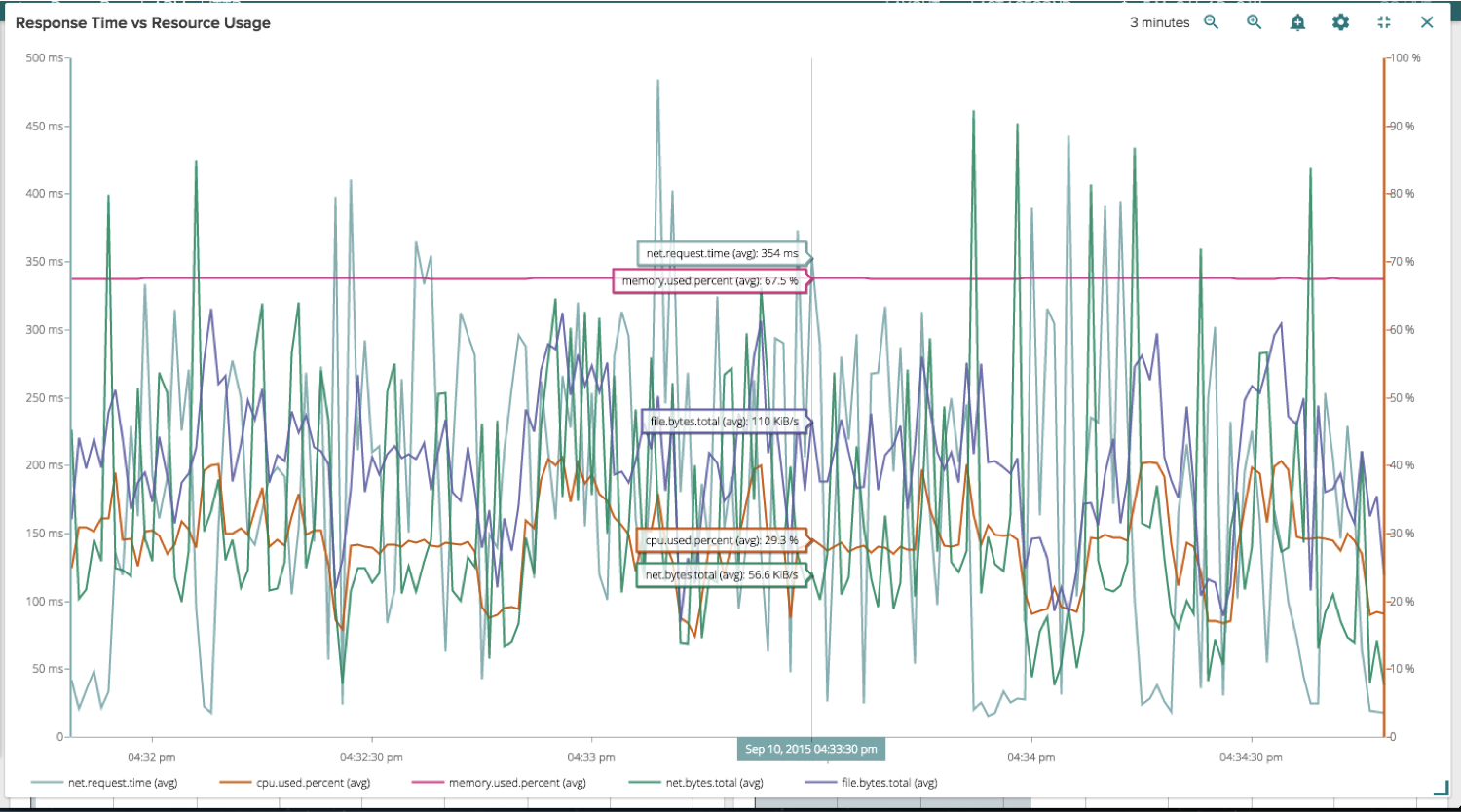
We’ve made the Explore section of our product much easier to use and navigate. You’ll notice that, by default, you have a larger workspace to dig into your infrastructure and analyze different views for your servers and AWS Services. Seeing your whole infrastructure, logically grouped by the tags of your choosing, all in one screen, is a great way to drill down into complex applications and highlight bottlenecks.
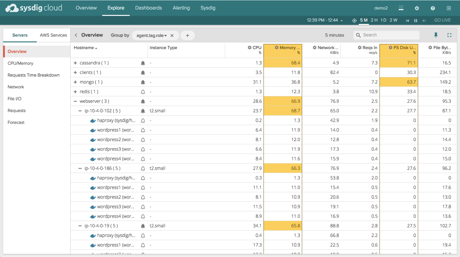
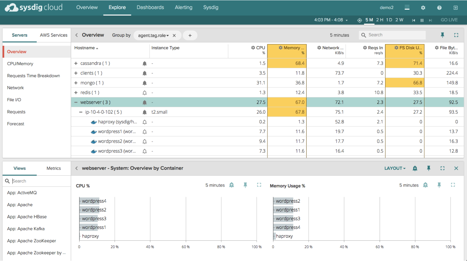
Then when you select an entity (a group, host, or container for example) a panel pops up that shows you all the different built-in views (which are pre-configured dashboards for all your common technologies) and metrics available to you. At this point you can easily filter the views and metrics list by simply typing in your topic or keyword of choice. Pivoting between dozens of different views and metrics is now super simple and straightforward.
Dashboards
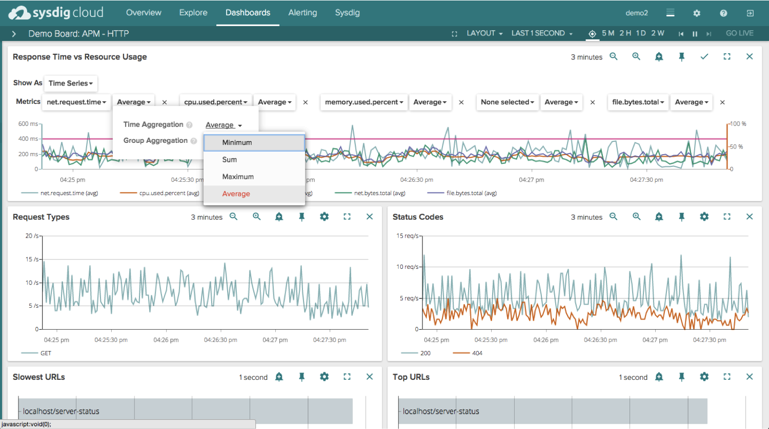
Now, when you view your dashboards, you’ll notice a few improvements that make managing and editing your dashboards that much easier. To start, you’ll notice that if you edit an existing dashboard we make it very clear exactly which values you can edit and what your different options are.
We also allow you to maximize the entire screen and eliminate the top navigation (if you wanted to display a dashboard in a NOC for example):
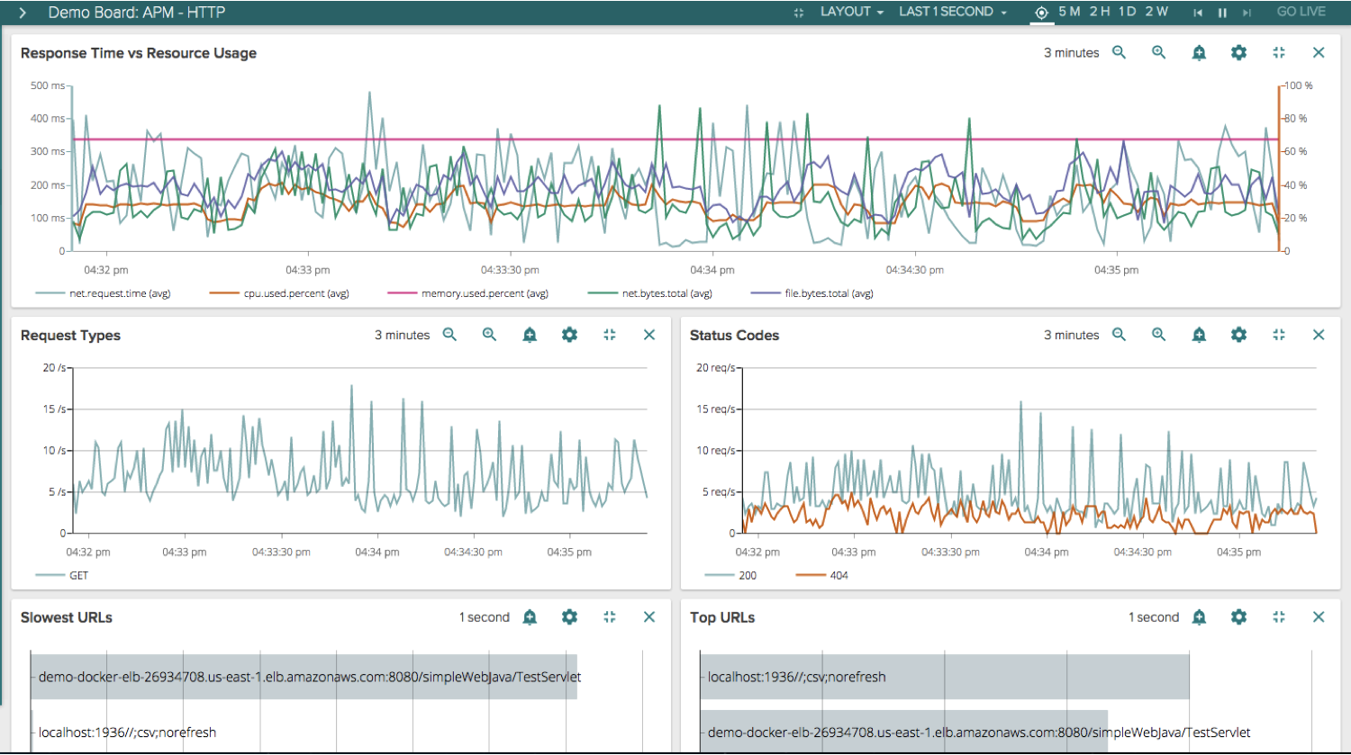
You can even go full screen with a particular widget if you had one that was particularly interesting:
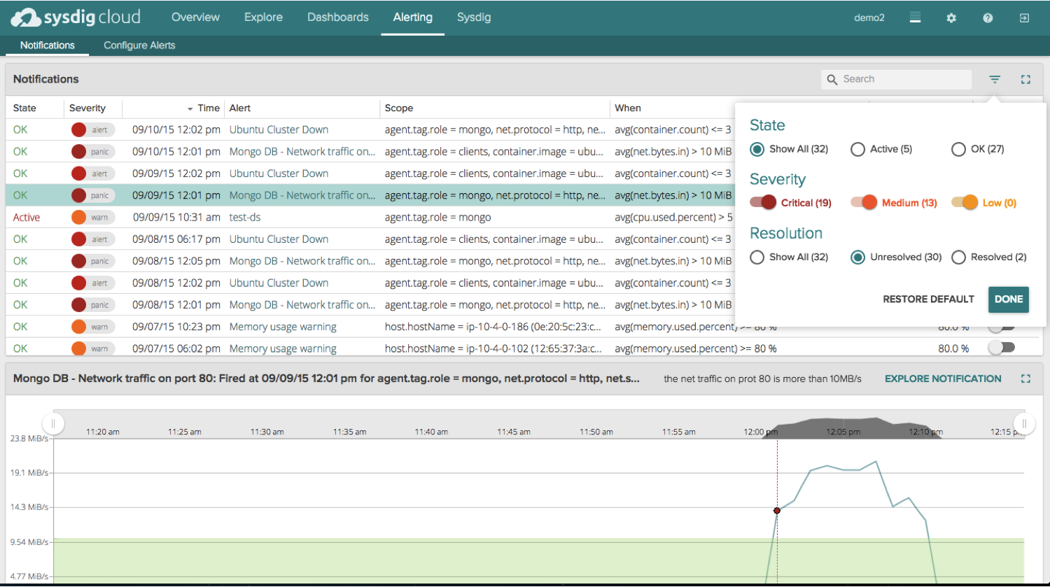
Alerting
I’ve already written about our awesome,
container-native alerting in the past so I won’t go back into a detailed explanation of our capabilities. Suffice it to say you can alert on any metric we are collecting, and alter the scope so the alert only fires when you want it to. We also have automatic baselines and host comparison alerts where our system can learn what is normal, expected behavior and notify you when we observe a value that is different than what we expect. Pretty powerful stuff.
With our new user interface, we’ve added two helpful data points to each alert – a
State and a
Resolved status.
If the alert fired from a temporary spike and then went back below the threshold, we tag those notifications as an OK state. However, if the alert fired and the value our system is observing is
still,
currently outside of the threshold you’ve set, we tag those notifications as an Active state. This is a great way to quickly identify and surface the issues that are causing performance issues
right now.
The Resolved status lets you easily mark particular notifications as resolved. By default we filter out those resolved notifications so you can focus on the notifications that matter – the unresolved ones :)
Not only do we append these two statuses to every notification, but we allow you to filter the entire notifications view by State, Resolved, and Severity so you have an easy and intuitive way to get to the information you want as fast as possible.
Conclusion
If you are already a Sysdig Cloud user, you’ll see the new user interface the next time you log in. Thanks to those of you who have provided the feedback that led to this new and improved experience. If you aren’t already a Sysdig Cloud user, I encourage you to
sign up so you can try out the new UI yourself and let us know what you think.
