


Falco Feeds extends the power of Falco by giving open source-focused companies access to expert-written rules that are continuously updated as new threats are discovered.
To accompany Sysdig's announcement of the first cloud-scale Prometheus monitoring offering, we had to re-architect our dashboarding experience from the ground up to support the Prometheus query language, PromQL. The query language is the standard method to query metrics within the ecosystem, and it's an entirely new way to slice and dice metrics within Sysdig Monitor. However, we wanted to ensure the steep learning curve associated with PromQL is not prohibitive for anyone wanting to build dashboards faster.
Using dashboards within Sysdig Monitor provides a complete end-to-end solution with support for both PromQL and our simple, form-based editor. You can see all of your Prometheus metrics federated across multiple clouds, troubleshoot problems with Sysdig's deep level of telemetry, provide RBAC to metrics with Teams, and ensure regulatory compliance with enterprise-grade access controls.
We're happy to announce the general availability of our next generation dashboards. Starting today, users within our hosted cloud environment can get started with our dashboards, and self-hosted customers will receive access to these features over the course of the next few months.
The good news is that all of your dashboards will be migrated for you – there's nothing you need to do. 🎉
PromQL or Sysdig's form-based querying – or unite both
PromQL is a powerful way to query your metrics within Sysdig; you can perform complex mathematical operations, statistical analyses, and use a variety of functions to dig deeper with metrics. Using PromQL, you'll now be able to answer more questions about the health and performance of your infrastructure using advanced functions and operators.
While mastering PromQL can make it feel like you've leveled up your monitoring expertise, it does have a steep learning curve which is something we didn't want to overlook. We've ensured that the form-based dashboard editor is retained for users wanting to get up and running quickly. If you want to run a basic query to have a look at your CPU usage grouped by each Kubernetes deployment, you shouldn't have to write complex PromQL queries composed of joins and functions. And it shouldn't be complex for non-technical folks who just want to run a simple report to perform rightsizing tasks.
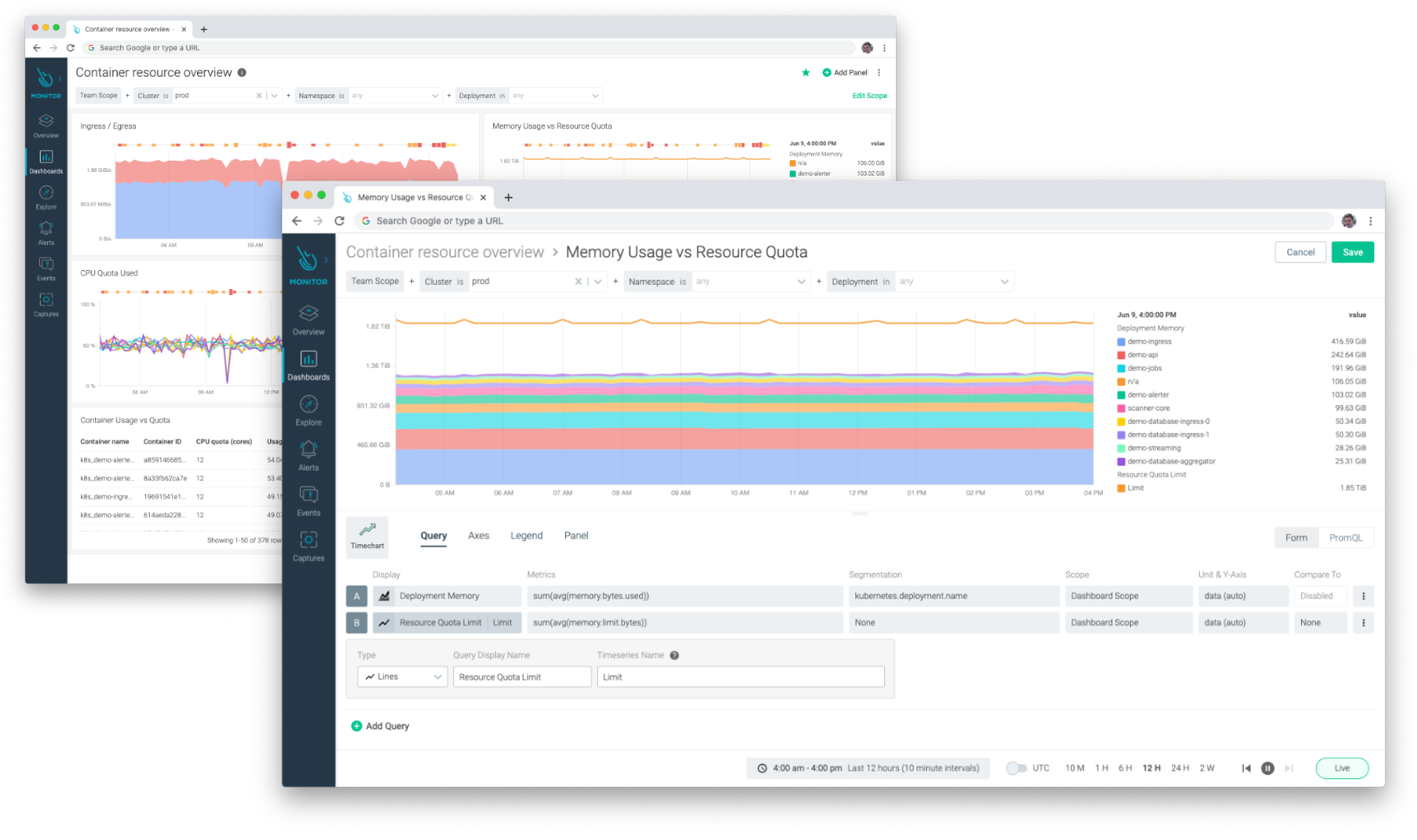
Answer questions about the health and performance of your infrastructure without any PromQL knowledge by using Sysdig Monitor's form-based dashboards
But what about when you want to know what the 95th percentile response time of web traffic in production was? Or what percentage of web requests were 5xx errors? How about the number of days before your file system fills up? And finally, how are you performing against SLOs over the last 30 days?
Beat outages by forecasting next week's file system usage
First, craft a PromQL query leveraging the predict_linear function to forecast next week's disk usage for a given file system. Then, map the forecasted values to text within a number panel to make it overly obvious if a problem is going to be expected, ensuring your team gets ahead of any issues.
We can then use the same query within Sysdig's alerting engine to notify the team that there's going to be a problem next week – via PagerDuty, OpsGenie, email, Slack, custom webhooks and more.
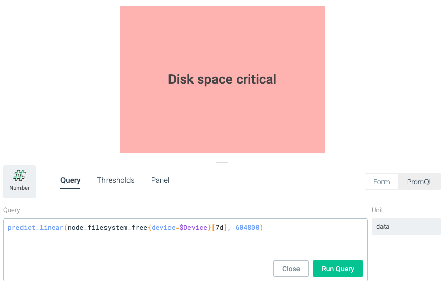
predict_linear(node_filesystem_free{device=$Device}[7d], 604800)\r\r1 week = 604800 seconds
Meet agreements by measuring SLOs using indicators
You can use the metrics being emitted from your infrastructure to measure your SLOs, ensuring that you're keeping within the boundaries of your SLA. With histograms, we can easily understand the percentage of requests successfully delivered within a given time frame.
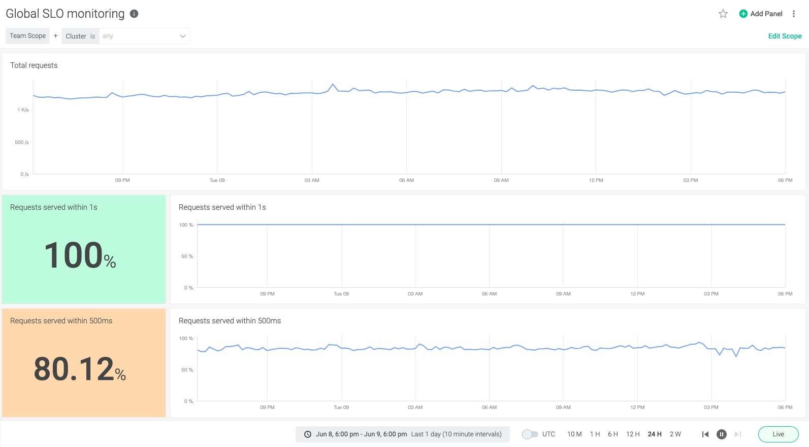
sum(rate(http_request_duration_seconds_bucket{le="1"}[$__interval])) by (kubernetes_cluster_name)/ sum(rate(http_request_duration_seconds_count[$__interval])) by (kubernetes_cluster_name)
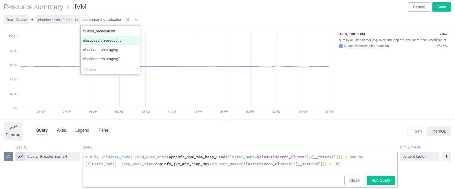
Slide and dice multiple metrics with mathematical operations
Try taking multiple metrics and perform mathematical operations on them. For example, you can calculate the percentage of JVM memory by measuring the maximum against real usage.
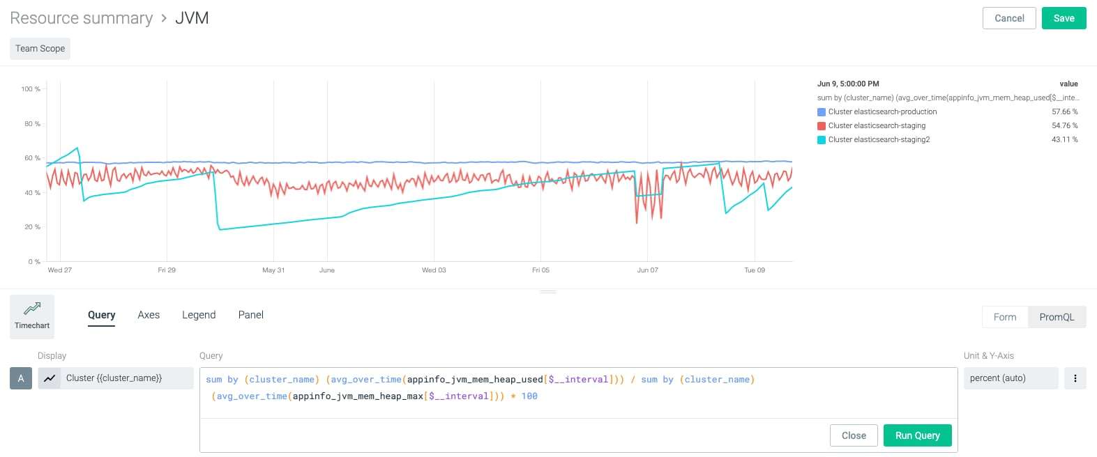
sum by (cluster_name) (avg_over_time(appinfo_jvm_mem_heap_used[$__interval])) / sum by (cluster_name) (avg_over_time(appinfo_jvm_mem_heap_max[$__interval])) * 100
Additionally, you can seamlessly unite both PromQL and Sysdig form-based panels within the same dashboard for a unified experience.
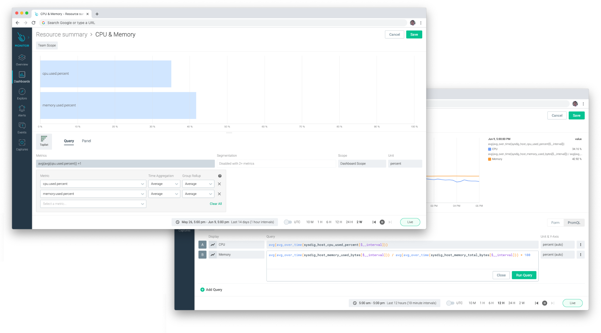
Use either PromQL or Sysdig's simple form-based view – or both – within Sysdig's new dashboards
What's new and improved?
We listened to feedback from our customers about what was great – and not so great – about our previous generation of dashboards, and have addressed them. Here's a list of what's new, and what's improved.
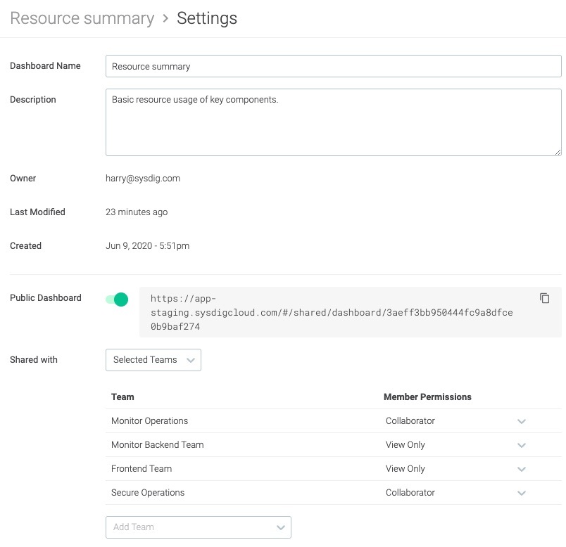
RBAC for Prometheus & improved dashboard sharing model
Sysdig Teams allow portions of your organization to only access the Prometheus metrics and telemetry that they care about. With full RBAC support, you can provide an application team responsible for maintaining an analytics tooling system access to only the metrics being emitted from their namespace, or give an on-call team read-only access to production hosts.
We're committed to continuous improvements of the multi-tenant sharing capabilities within Sysdig Monitor, and we know our customers want to create a single dashboard and share it across their Sysdig Teams. They also want more fine-grained sharing controls.
Starting today, you can share your dashboard with users within your Sysdig Team, or share it across Teams with fine-grained access controls. Define who should be able to see those dashboards and what level of access they should be granted (View Only, or Collaborator with edit privileges).
Intelligent $__interval
Use $__interval within a query and Sysdig will intelligently populate the query with the most appropriate sampling depending on the time range you've selected. This ensures that we balance providing access to the most granular data available while downsampling when you select a long time range.
Scope variables
Configure scope variables at the dashboard level to quickly scope based on cluster, namespace, workload and more. You'll be able to dynamically use that $variable within the query. This is very important when troubleshooting as it allows you to switch context quickly without reconfiguring PromQL queries.
appinfo_jvm_mem_heap_used{cluster_name=$elasticsearch_cluster}
Smart autocompletion & syntax highlighting
Autocomplete suggests metrics, operators and functions, while syntax highlighting helps keep you on the right path and highlight problems within a query. This is invaluable in dynamic environments, and allows you to craft the right queries faster.
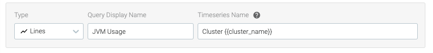
Time series name templating
Customize the time series on dashboard panels by using labels associated with Prometheus metrics and segments to gain context faster. For example, if a metric has a label indicating the job type, use {{job_type}} as the time series friendly name.
Improved user experience
We've introduced a more fluid, natural dashboard building experience. The UI has been redesigned and a new panel editor makes it easier to craft the best way to visualize your metrics. They look really nice too!
A new editing experience utilizes the entire page, making it easier to craft panels.
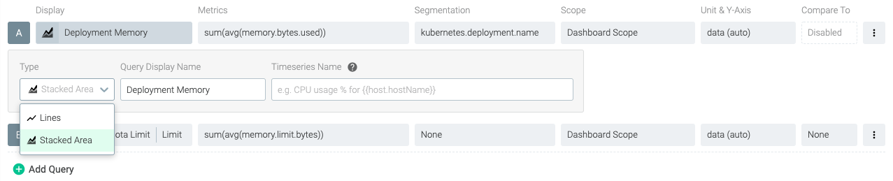
Multi-metric, multi-segmentation
Configure multiple queries within a single panel, and configure each query with multiple segmentation and scoping options. Individual queries can be customized to render as a line or stacked area. For example, you could stack up the memory requests of all pods within a namespace as an area chart, and graph the maximum memory quota as a line chart to understand capacity issues.
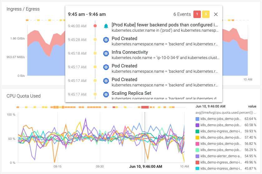
Event overlays
Contextualize metrics and understand the "why" faster with a unified view of both metrics and events. Configure Event Overlay to display events from Kubernetes (deployments, node failures, etc.) as well as alert events, security violations and any other events ingested using Sysdig's open REST API.
Dashboard templates
Get up and running quickly with dashboard templates; view your infrastructure through the lens of one of Sysdig's curated dashboards, or use it as a base to start building your own. We have dashboard templates for managing Kubernetes capacity and health, hosts and server performance, applications and services telemetry, and the security posture of your infrastructure with data fed from Sysdig Secure.
Additionally, we've released PromCat.io, a resource catalog for enterprise-class Prometheus monitoring. Leverage a complete turnkey solution to monitor Kubernetes and cloud-native applications with supported Prometheus exporters, coupled with meaningful dashboards and alerts to accelerate developer productivity faster.
You'll find dashboard templates in the dashboard navigation. You can use predefined scope variables to easily see metrics from specific entities within your infrastructure. Keep in mind, dashboard templates aren't designed to be edited, but we've made it simple to copy one and start customizing it.
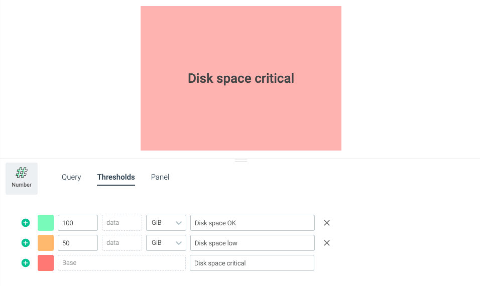
Map values to text
Instantly understand what's going on by mapping number panels values to text. If you have a metric that returns 1 for up, and 0 for down, map those values to "UP" and "DOWN" respectively. No longer doubt if you should be concerned about a value by defining your thresholds. This is critically valuable when dashboards are shared between team members.
Granular axis and legend controls
Get granular with your axis and legends. We've introduced more flexibility when customizing your axis, as well as better support for time series with long names. You can now configure the legend by toggling its visibility and moving it to the bottom of the panel.
The future
We're delighted to release these new dashboards with PromQL capabilities and an entirely new user experience. We're already hard at work building additional dashboarding functionality to support more flexible visualizations, as well as improvements to make it easier to build and manage dashboards. We'd love your feedback, not only on our new dashboards, but on what you'd like to see next.