


Falco Feeds extends the power of Falco by giving open source-focused companies access to expert-written rules that are continuously updated as new threats are discovered.
This new feature release continues our drive towards simpler monitoring of microservices versus monitoring servers, or even monitoring docker containers that your services may be built upon. We now provide pre-built views that can give you deep insights into the performance of your services. These are generic views in the sense that the data can apply across the performance of almost any service. From there you might dig in further to application specific metrics or custom metrics. So let's start by taking a look at each of these Service Views.
\r\r
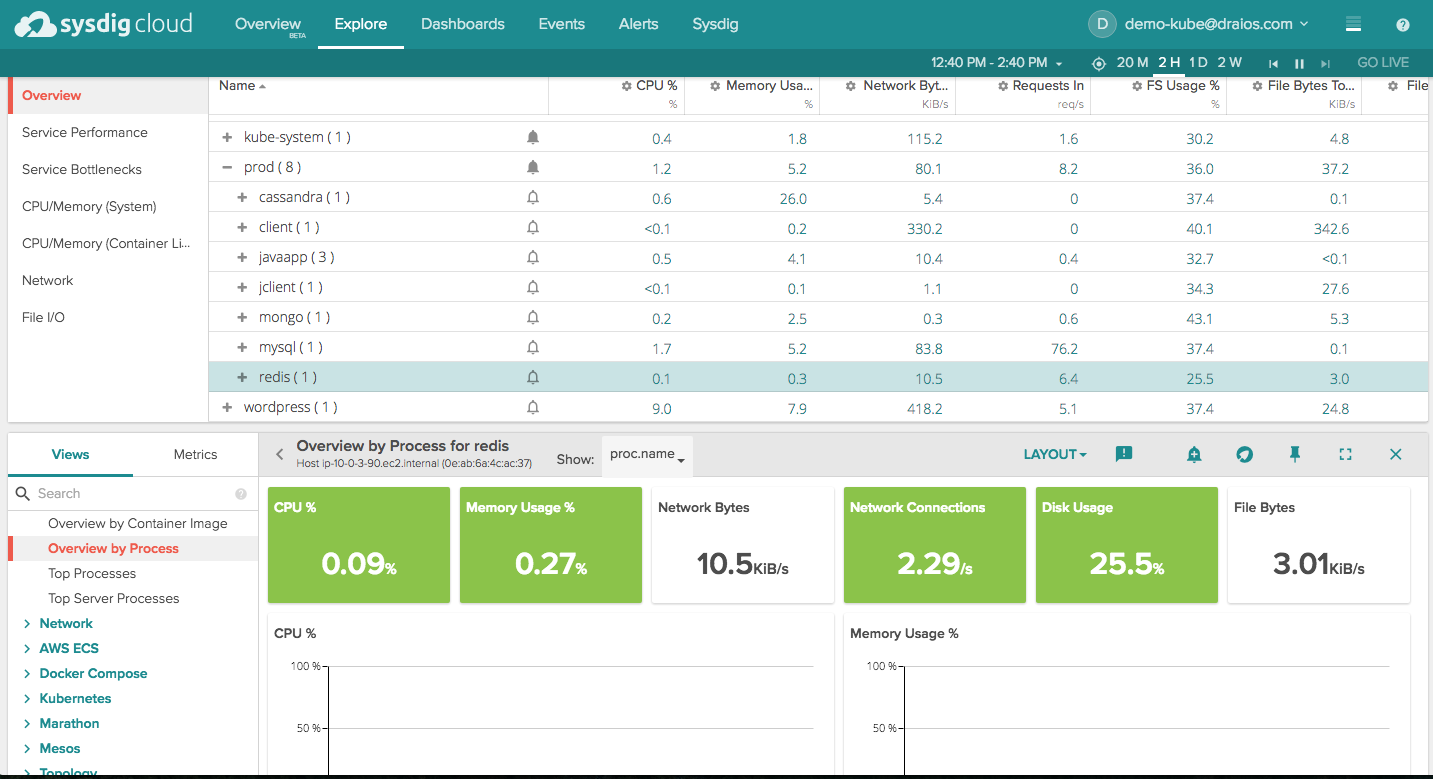
You access our pre-built views by clicking on any row in the explore table. You can think of this as defining the scope of the view that you will see below the explore table. Depending on your groupings, you could be looking at a host, a service, a container, or a custom grouping based on a label. For example, I'll start by choosing the Prod namespace, which means I'll get an aggregated view of everything in Prod.
\r\r
\r\r
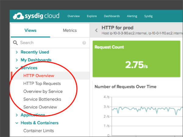
Views appear in the lower section of the explore page, and the left hand menu gives us a large selection of possible ones to examine. We're going to scroll or search our way to the "Services" section.
\r\r
\r\r
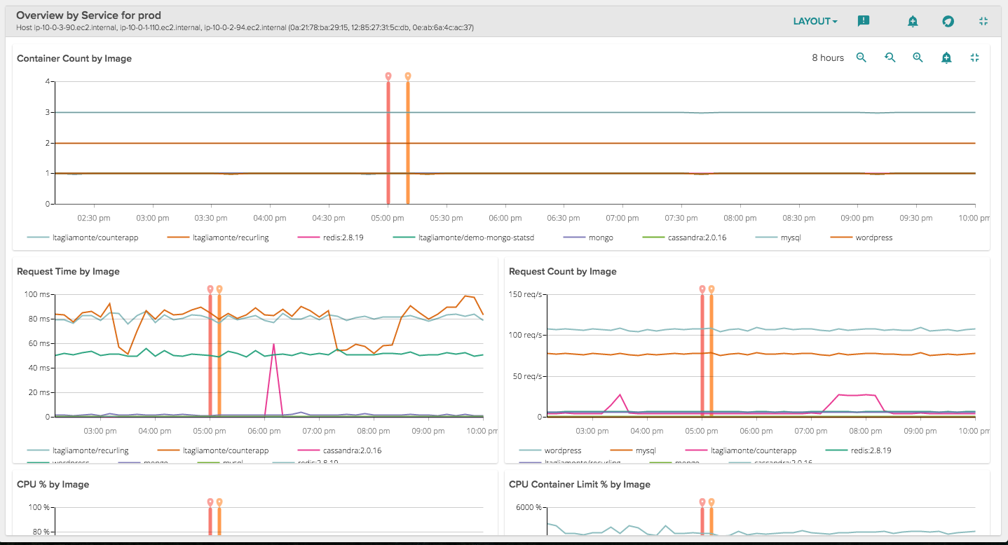
To start, let's get a sense of what's happening in Prod using the Overview by Service dashboard. Apply this view to a group of services to get an overview of the size, performance, and limitations of each service. In this view, services are defined as sharing the same container image. For example, we see in the first chart that we have three services running with steady container counts, but one service has particularly variable request time. That's something we might want to examine further.
\r\r
\r\r
Note, specialized views are also available showing service breakdowns based on your particular orchestrator (eg. Docker Swarm, Kubernetes, Mesos/Marathon). These additional views can provide more details and are designed to use the metadata particular to that particular orchestration system.
\r\r
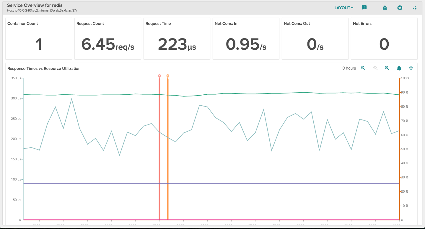
Next, we might click down in the explore table on to a particular service and take a deeper look, starting with an Overview for that Service:
\r\r
\r\r
This gives us an overview of busyness (requests), performance (request time), errors, and resource utilization. Again, a pretty useful way to quickly assess if there is anything that requires further analysis.
\r\r
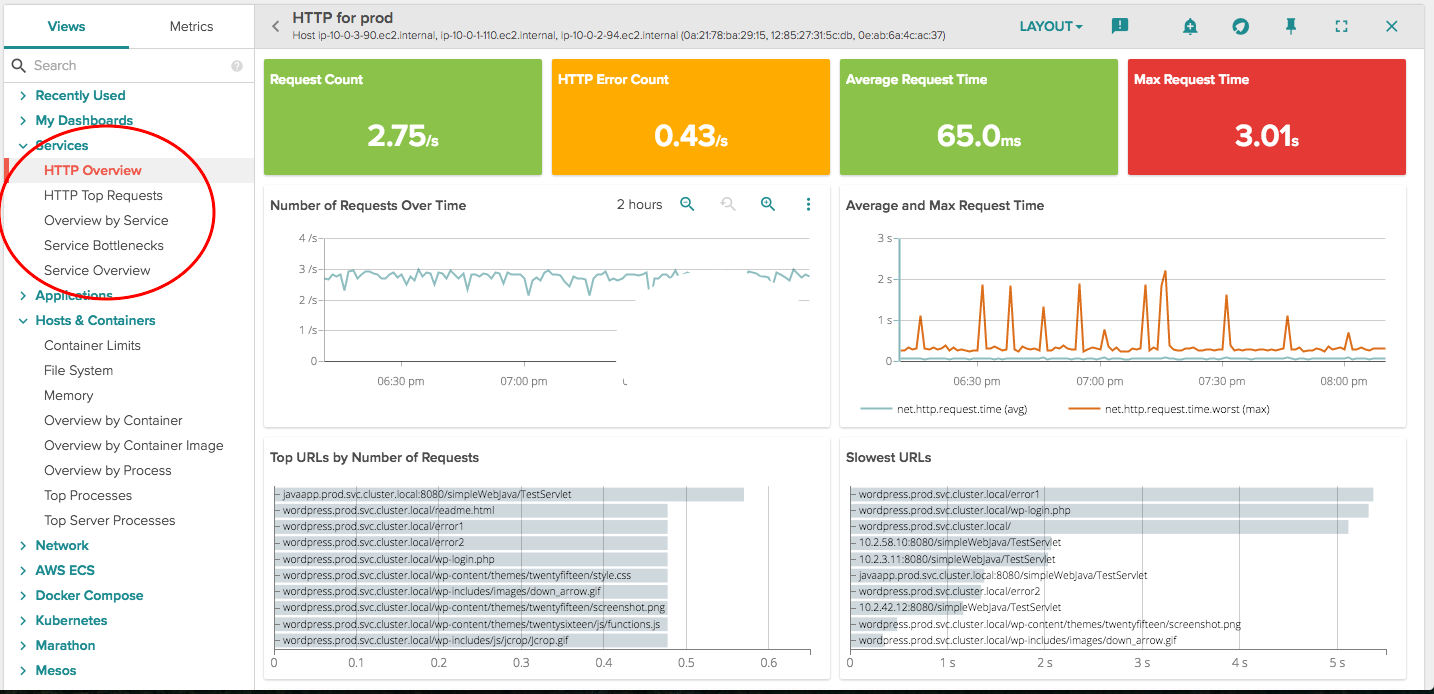
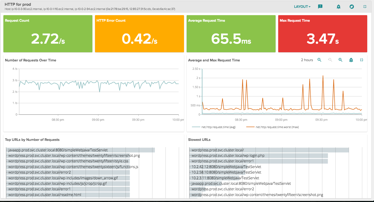
Since many of your services use HTTP endpoints at their main interface, we've provided a set of views that will specifically tell you how that interface is performing:
\r\r
\r\r
The HTTP Overview Lists top URL requests with response and status code metrics. You can Use the Number of Requests and Avg/Max Request Time panels to gauge overall busyness of your server. Use the Status Codes metric to keep an eye on problems with excessive 4xx and 5xx error codes.
\r\r
In the middle, you'll see something that you typically have to purchase a separate APM product for: analysis of how particular endpoints are performing. You can see if correlations exist between the Top URLS and Slowest URLS panels to find opportunities to significantly enhance performance of the service.
\r\r
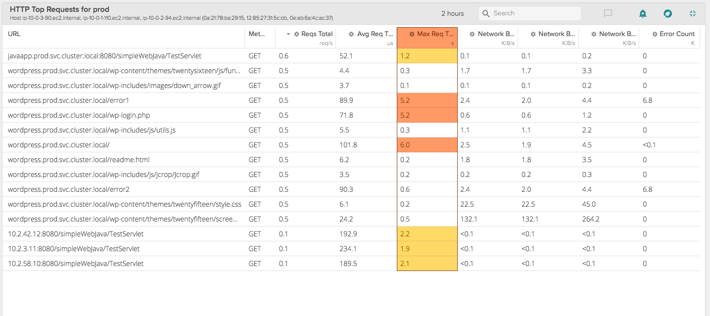
For you table lovers out there, the Top Requests view Table view lists the top 15 endpoints by request count with performance metrics. We get down to Method type, so you can really dissect and segment performance effectively.
\r\r
\r\r
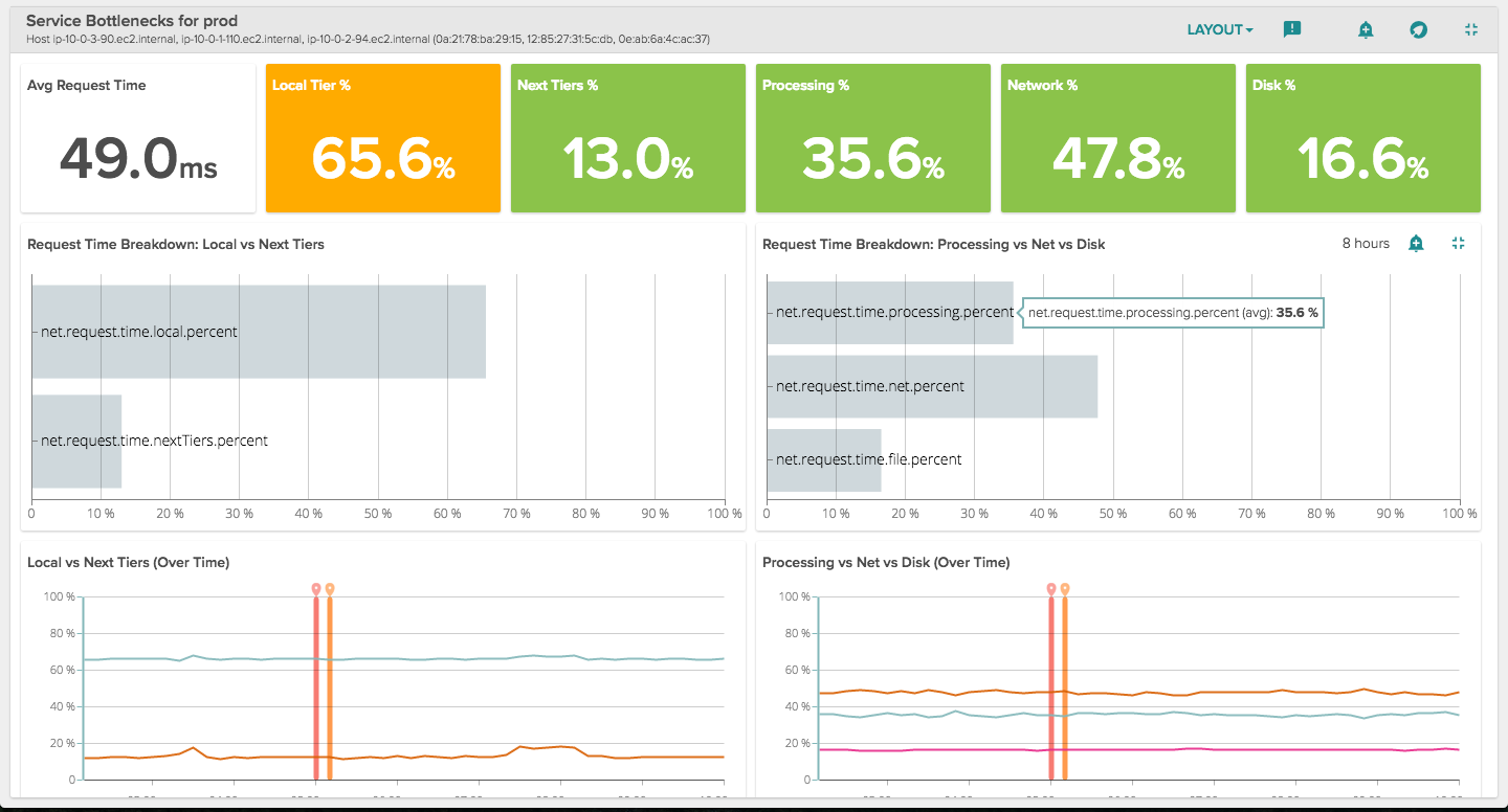
Monitoring Micrservice Bottlenecks
\r\r
If you've got a problem within a service, or are working with your team to understand where you might best improve it, this view will help you immensely. It provides various breakdowns of processing times for an individual service.
\r\r
\r\r
Local vs Next Tiers provide both a bar chart as well as a time chart. These panels show the amount of time that requests spend in local versus remote tiers of a distributed transaction. For example: in a scenario where a client makes a request to a web server (local tier) which in turn, makes a request to a back-end database server (next tier), the Local vs Next Tiers panels show the time in percent that the request spends in each tier.
\r\r
Processing vs Net vs Disk show the amount of time that local requests spend on processing, network i/o, and disk i/o.
\r\r
Conclusion
\r\r
The service abstraction has been a powerful concept for developing complex distributed software; there's no reason that same abstraction can't be used for monitoring your services. In these views we provide you a simple way to get started with monitoring your services. Give them a shot today! If you're not using Sysdig yet, grab a free trial!