


Falco Feeds extends the power of Falco by giving open source-focused companies access to expert-written rules that are continuously updated as new threats are discovered.
We're really excited to round up all the great functionality we've released so far this year on Sysdig Monitor into our Spring Release.
\r\r
Here we're going to give you a quick run-down on the most important features and where possible, link you to more detailed information on how to use the features.
\r\r
If you've got questions on any of these features, or want our assistance using them, we'd love to help you!
\r\r
Chat us in through the app or drop us a line at @sysdig.
\r\r
Updated integrations with orchestration systems
\r\r
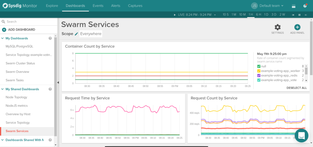
Docker Swarm
\r\r
We just released Docker 1.13 support together with out of the box support for Docker Swarm. New metrics like Swarm quorum, multiple new metadata labels like services, tasks, nodes, etc, and of course our topology maps now support Docker Swarm too. Read more about it on How to Monitor Docker Swarm.
\r\r
\r\r
Kubernetes 1.6
\r\r
Kubernetes is a fast evolving project and we also move fast to provide support for the latest features available in version 1.6, including multi-cluster support for having all your clusters in your Sysdig Monitor account.
\r\r
Mesos improvements
\r\r
Mesos, DC/OS and Mesosphere family are first class citizens at Sysdig Monitor. Now you don't need to manually configure pulling out metadata and metrics from these platforms, it will be automatically detected by our agent.
\r\r
Usability improvements
\r\r
Monitoring microservices is a complex task, getting visibility inside containers wasn't trivial until the arrival of Sysdig. That's why usability is important for us, and has been a main focus in the last months. Dashboard has received multiple improvements, simple changes that contribute to make monitoring with Sysdig a better experience:
\r\r
- \r
- Building a dashboard from any of the available templates now follows a more streamlined process thanks to the new wizard. This wizard shows the most popular templates, allows to filter them or select the initial scope. Remember that Sysdig Monitor provides dozens of templates for the different services we monitor and the orchestration tools we support. \r
- If you would rather build your own dashboard from scratch, you can start from an empty one. Each dashboard can override every panel scope with a global dashboard scope. \r
- You can share dashboards with other team members and copy them between teams (together with alerts), and if the new team needs to change the scope because they don't have visibility permissions, they will be automatically notified. \r
- Dashboard settings have been consolidated and panel edit controls improved, with an implicit save required to avoid erroneous changes. \r
- A full screen mode is available for display mode in your ops war room. \r
- Dashboards can be exported and imported through our API, find some examples in our API Python wrapper. \r
\r\r
Some other improvements are available in other places like:
\r\r
- \r
- Comparisons operators have been implemented across the whole UI (dashboards panels and alerts too), being able to use the expressions 'is', 'is not', 'not in', 'contains', 'does not contain' and 'starts with'. \r
- Data tables show all available data with pagination, instead of the top 20 results, either if we have them as panels in a dashboard or in a Explore view. Columns can also be resized to the desired width. \r
\r\r
Improved alerting
\r\r
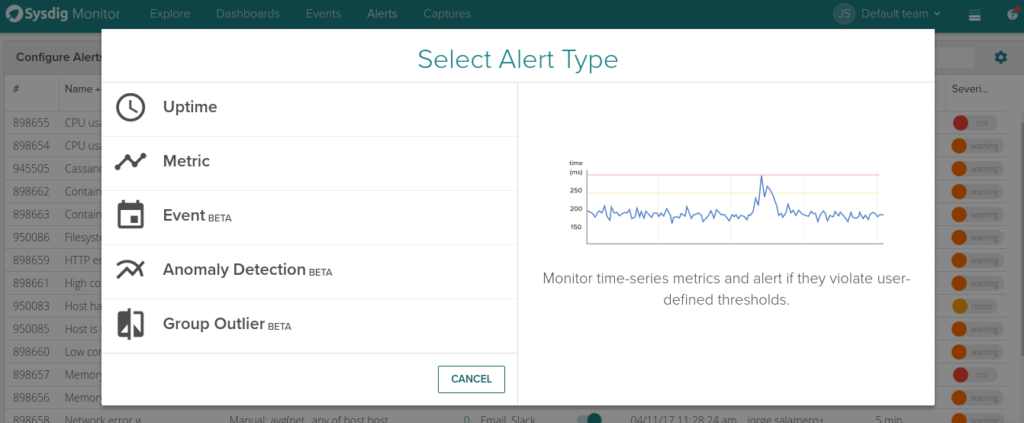
We have improved how you can create an alert within Sysdig Monitor. Now you are presented with a wizard that allows to choose between:
\r\r
- \r
- Uptime: alerts to detect when a node, service/application or any other entity is down (not available or not defined). \r
- Metric: alerts based on metrics applied across a given scope with trigger conditions like wait time or triggering multiple alerts for each instance of a given metadata. \r
- Events: new functionality that allows count the number of events matching a criteria (names, tags, description), alert if the count exceeds a threshold. For example, alert if any of your pods is in a CrashLoopBackOff event. \r
- Anomaly Detection: chose one of more metrics as a baseline and if the behaviour changes from what has been the pattern, will trigger an alert. \r
- Group Outliner: think of a metric that should behave the same in multiple segments, e.g.: a service behind a load balancer or a set of pods inside a replicaSet. If any instance behaves atypically, you will get notified. \r
\r\r
\r\r
Performance and scale
\r\r
A tremendous work has been happening behind the scenes. We have achieved a 10x scale in our backend, although we won't stop there. This allows on premise customers to lower the hardware requirements for the same number of metrics and events they are collecting at the moment. Thanks to this improvement, SaaS customers have also seen their metrics and events limits increased!
\r\r
From a user perspective we have released Fast Dashboards. Loading is now way faster, both dashboards as a whole and individual time series graphs.
\r\r
But sometimes you just have too many metrics that you will never need, our agent can now filter them out with the metrics_filter option. This allows to include the metrics you know you want and exclude the ones you know you don't want.
\r\r
Security improvements
\r\r
A bunch of new features will make the most security concerned people very happy. Sysdig Monitor agent is now a Docker Certified container, giving you all the guarantees that the container is using the best practices and is regularly scanned against known vulnerabilities. Actually, scanning all containers is now part of our CI process so either if you are using just our agent or deploying the Sysdig Monitor on-prem, you get updated images with latest fixes.
\r\r
Improved authentication is all around too, Google oAuth for SaaS and on-prem, authentication between all the microservices that build up the on-prem version or you can restrict non-admin users from access to the access key, which can be rotated to accomplish with your credentials rotation policy.
\r\r
New time series charts
\r\r
We got a new rendering for time series charts! The legend is now more interactive: you can hover over the lines or the legend entries to identify the metric, select and deselect them on the legend and sort them. Also, the legend will appear either on the side on wide panels or as a non-intrusive overlay when the panel is smaller.
\r\r
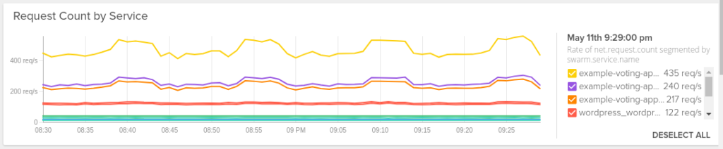
Some other improvements will be appreciated by the graphs fans. 'null' values are represented as no data instead of 0, you will be able to search for values not present in the chart, and multiple y-axis are supported. The scale can be either logarithmic and also fixed or dynamic depending on the values rendered.
\r\r
Percentiles
\r\r
The agent can now calculate percentiles for the most common metrics. Just enable percentiles: [50, 95, 99] in your dragent.yaml and the new metrics will be available in the UI.