
The amount of new releases, events, and products coming from our team in the last few months is almost unbelievable. Take a minute to meet our new family members: Sysdig Secure and Sysdig Inspect, and then continue reading to learn more about new Sysdig Monitor features and updates.
Here we’re going to give you a quick run-down on the most important features and where possible, link you to more detailed information on how to use the features.
If you’ve got questions on any of these features, or want our assistance using them, we’d love to help you! Chat us in Sysdig Slack or through the app or drop us a line at @sysdig.
Prometheus metrics support and auto-discovery
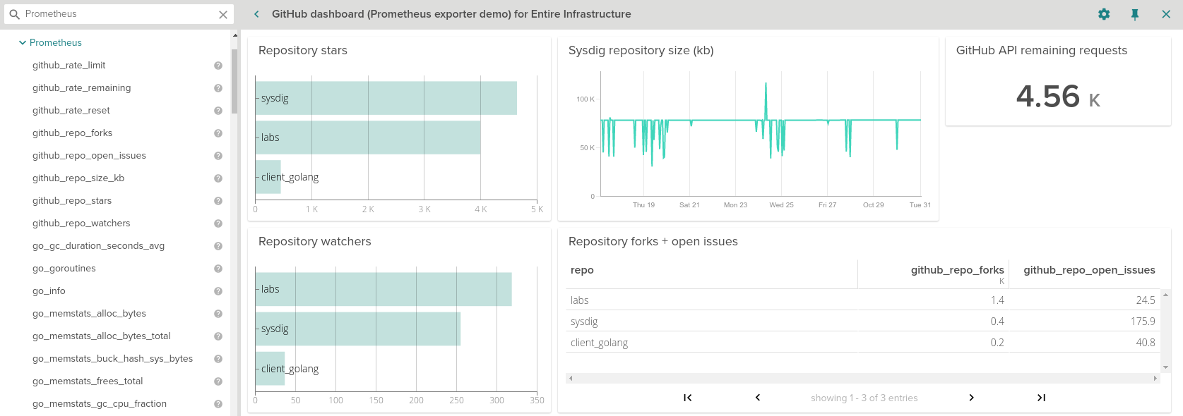
Sysdig Monitor will automatically detect Prometheus metrics. This is done by pattern matching against standard Kubernetes annotations, container images/names/labels, standard ports or process names. These metrics will show up in a new Prometheus folder under the Metrics section on the Explore page. You can create dashboards, set alerts and analyze your Prometheus data by applying all the existing grouping, scoping and segmentation capabilities.
Sysdig will autodiscover the metrics you already expose and provide additional metadata on top, the same way we tag absolutely everything.
Dashboards and charts
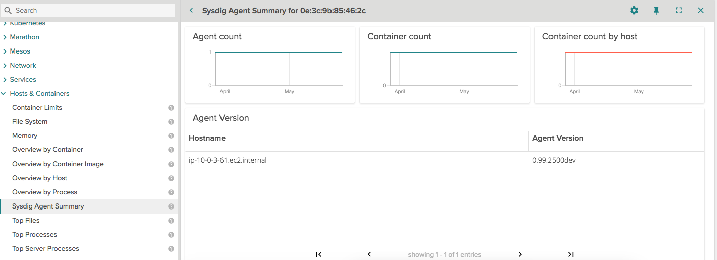
New agent dashboard summary. This dashboard provides you insights into all your Sysdig agents across all hosts in your environment. Best way to find out if all your Sysdig agents are up to date! Remember, we keep a public Sysdig Agent changelog that you can also follow via RSS.
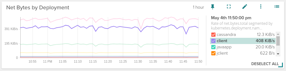
Time-series graphs engine has been updated. Now the legend appears on the right hand side or as an overlay when the panel is small enough. A more compact and clean look where you can quickly identify the metric you want just going over the legend entry.
If the cardinality of the metric you are looking at is too high (imagine you had hundreds of Kubernetes pods during an extended period of time), you can now filter by the top/bottom N elements for any series, bar, stacked or area charts.
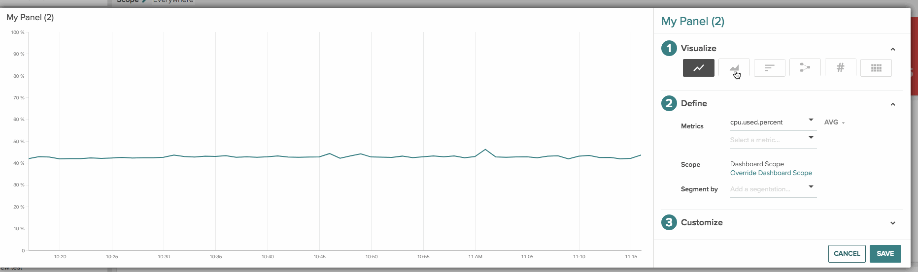
There are two new available visualization formats for your dashboard panels:
Table format: Here the columns represent metrics and the rows represent segments which are used to aggregate the metrics such as pods, services, hosts, containers, processes and so on. You can see an example to the Github exporter screenshot above.
Stacked area chart: You can create this view by either choosing multiple metrics with the same unit and aggregation or choosing a single metric with a single segment (similar to a time-series line chart).
A few more dashboard and panel goodies:
Saving dashboard changes: from now on, when you do any layout change in your own or shared with you dashboards, you will have to explicitly save changes or discard them. No need to freak out anymore when you edit a layout by mistake!
Organizing metrics and default dashboards: Now, your metrics are organized based on its data source – host, containers, AppChecks, StatsD, JMX, system or network just to name a few.
Advanced Y-axis settings: you can decide between fixed (as it was now) or dynamic range; linear, logarithmic or exponential scale and also show multiple axes when visualizing multiple metrics.
Advanced Operators: ‘in’ and ‘not in’ to match for or against a list of variables while setting the scope of a dashboard. For eg:
kubernetes.namespace.name in 'prod, dev'orhost.ip.public not in '172.20.40.10,172.20.40.12,172.20.40.14'.
Improved Alerting
Several updates in the alerting department, both functional and visual.
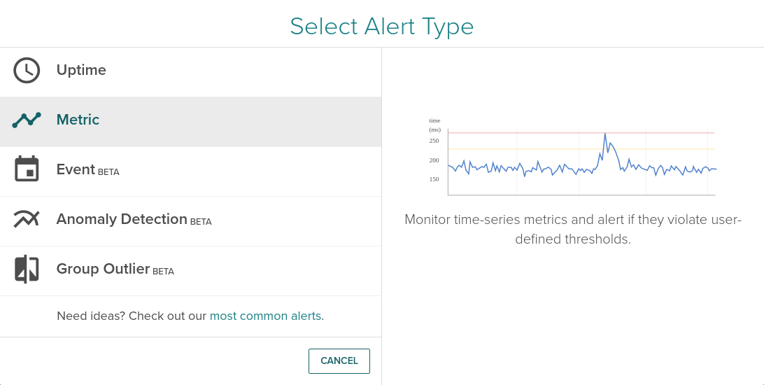
Brand new alerting UI! Now creating an alert is easier than ever. A wizard will guide you through the process of creating a new alert based on Uptime, a Metric, an Event, Anomaly Detection or Group Outlier.
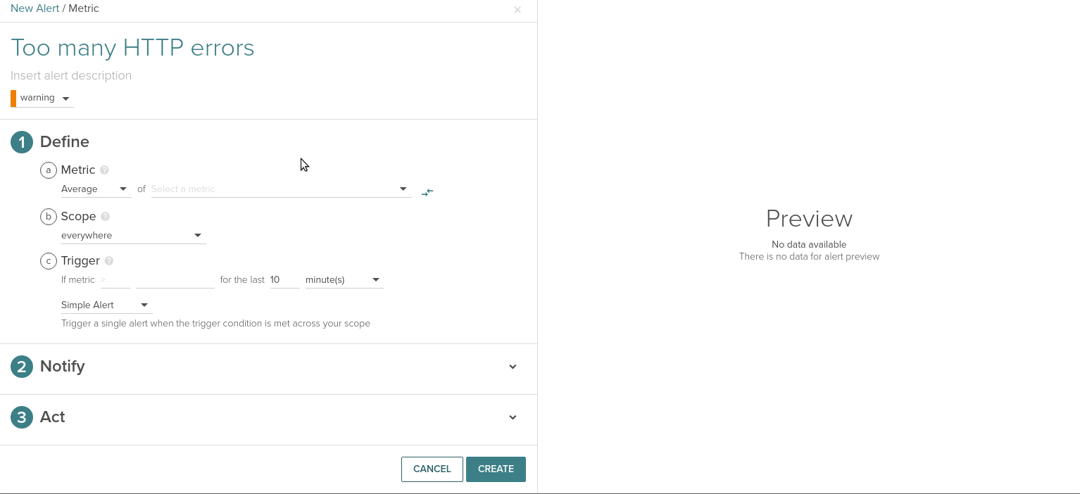
Also, using the new alert interface, you now have a preview of the configured triggering threshold against the value of selected metric and scope in the past. This way you can choose better threshold values.
There is also a new shortcut on the Explore view. You will see a small alert bell icon that will lead you directly to the alerting interface for the desired infrastructure entity.
Regarding alert functionality we have all this new items for you:
PagerDuty notification channel updates: Pagerduty alerts will now include fields like timestamp, UTC, alert name, alert description, severity, alertId/eventId and links to the alert.
Alert on events: Such as pods / containers killed, restarts or software deployments and monitor threshold limits for each of these events – for example: trigger an alert if any of your pods generate a CrashLoopBackOff event.
Customizable alert notifications: Both the subject and the body of your message can be tailored to suit your requirements. The message template will automatically fill several parameters for you like metric, scope, trigger conditions and current value, etc
Export alerts as JSON: Alerts can be downloaded as a JSON file to see the raw structure and update it using a text editor. Modified JSON can be uploaded using our API.
SSO and user authentication
Sysdig Monitor has integrated several auth options to make your life much easier if you need to support an existing user directory for your infrastructure. In addition to Google OAuth, you can now use OpenID and SAML.
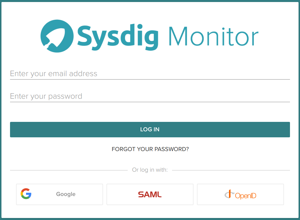
On the login screen click on the OpenID icon to access Sysdig Monitor (SaaS) via SSO. check the OpenID customer docs for further details.
You can also use Security Assertion Markup Language (SAML). SAML works in conjunction with identity providers like Okta and Onelogin for SSO access to Sysdig Monitor. Again, we have compiled specific SAML customer docs to help you with your setup.
Explore tab and general usability options
We have updated our Explore feature with a new row at the top labeled as Entire Infrastructure. The Explore interface now allows you customize how the selected metric is displayed within the Explore tab. Those options already available in Dashboards like panel type or Y-axis range and scale customization can be used here too.
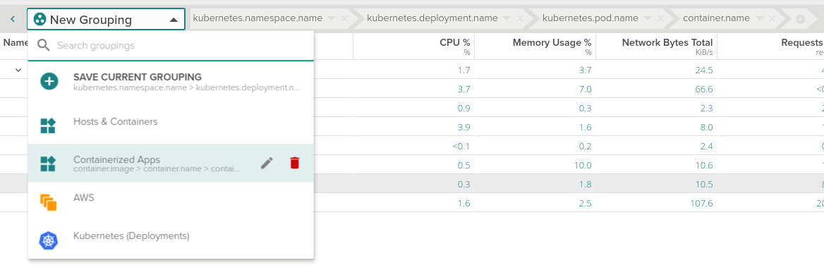
From the Explore tab you will also notice that grouping dropdown has been redesigned. Now it’s easier to view, select, edit and delete the Explore table groupings.
Additionally, the side menu of the Explore table was replaced with a simple dropdown menu which lets the user choose which data source should be accessed to show data (Sysdig Agent metrics, AWS, etc).
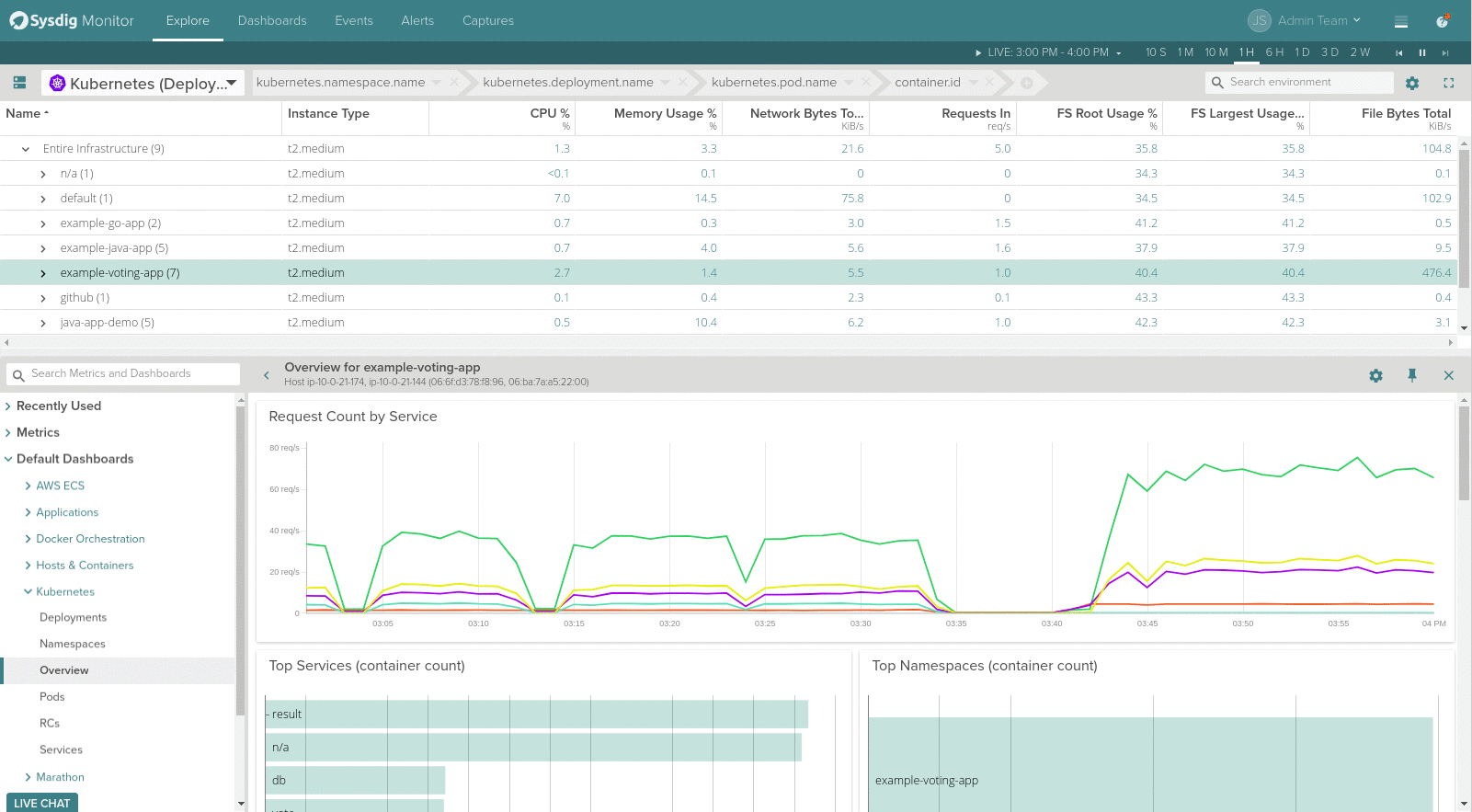
The separator between the Explore table and the drilldown views can now be moved up and down for resizing, giving more screen space for visualizing metrics and pre-built views of the selected scope above.
Users can switch between UTC and local timezone via controls in the time navigation. Changes are reflected wherever we show dates/times across the entire application.
Default Team has been renamed to Admin Team. In addition, now you can configure the default team for any new user. The idea behind this change is to automatically place new users in a restricted access group.